As I’ve worked in content and email marketing for many years, I’ve seen trends come and go, but few have made as big an impact as dark mode.
If you’re not familiar with it, dark mode is a display setting that swaps out light backgrounds for darker ones, often using light text on a dark surface.
Over the past few years, dark mode has surged in popularity among users across various devices and platforms, and it’s not just a passing fad.
But with great dark mode comes great responsibility. As more and more users opt for this darker display setting, it’s becoming increasingly crucial for businesses and email marketers to ensure their emails look just as stunning in the dark as they do in the light.
In this post, I’ll walk you through some best practices for designing flexible display mode emails. These tips will help you create emails that look great and function well, no matter how your audience chooses to view them.
Understanding Dark Mode
The main difference between light and dark mode is pretty obvious. In light mode, you typically see dark text on a white or light-colored background. Dark mode inverts this, giving you light text (often white or light gray) on a dark background (usually black or dark gray).

But it’s not just about switching colors. Dark mode often adjusts other elements too. Images might be dimmed slightly to prevent them from appearing too bright against the dark background.
And it’s important to note that dark mode isn’t just about emails. Many apps and operating systems now offer a dark mode for people who prefer to work and play on the dark side.
What’s So Great About Dark Mode?
People tend to have strong opinions about dark mode. Those who use it may even snub apps that don’t offer it as an option. And the use of dark mode has increased dramatically in recent years. But what’s the big deal?
- Easier on the Eyes: Many users find dark mode reduces eye strain, especially when using devices in low-light conditions. No more squinting at a bright screen in bed!
- Battery Saver: On devices with OLED or AMOLED screens, dark mode can significantly reduce battery consumption. Who doesn’t want their phone to last longer?
- Improved Readability for Some: Particularly for users with certain visual impairments, dark mode can make text easier to read.
- It Just Looks Cool: Let’s face it, some people simply prefer the sleek, modern look of dark interfaces.
According to a 2020 survey by Android Authority, 81.9% of their readers use dark mode on their smartphones. It seems dark mode is here to stay, and it’s beloved by many.
As email senders, it’s important to embrace this shift. It’s not just about keeping up with trends; it’s about ensuring messages are clear, readable, and effective for all recipients, regardless of their display preferences.
Pro tip: While you’re focusing on perfecting your dark mode design, don’t forget about deliverability. Even the most beautifully crafted email won’t make an impact if it doesn’t reach the inbox.
That’s why it’s highly recommended to use a reliable SMTP service like SendLayer to ensure your transactional emails consistently land in your recipients’ inboxes. Plus, SendLayer’s detailed analytics help you track delivery rates, opens, and clicks, giving you valuable insights to further refine your email strategy.
Why Dark Mode Matters for Email Design
The way your emails look can make or break your communication. With dark mode gaining traction, it’s crucial to understand why it matters so much for email design.
Considering User Experience
You most likely craft your emails with care, choosing every word to convey your message effectively. But if your recipients can’t comfortably read that message, all your efforts go to waste. That’s where dark mode comes in.
As email senders, we don’t get to choose how our recipients view our messages. Some prefer light mode, others dark mode, and many switch between the two depending on time of day or environment.
Dark mode can significantly enhance the user experience, especially in certain conditions:
- Late-night reading: Many people check emails before bed or first thing in the morning. Dark mode can make this easier on the eyes.
- Low-light environments: Whether it’s a dimly lit office or a cozy coffee shop, dark mode can improve readability in less-than-ideal lighting conditions.
- Extended screen time: For those who spend hours in their inbox (we’ve all been there), dark mode can help reduce eye strain and fatigue.
By optimizing your emails for dark mode, you’re essentially saying, “I care about your comfort and experience.” And your recipients are sure to notice and appreciate that.
When Emails Go Dark
Now, here’s where things can get tricky. If you don’t consider viewing preferences when you design your emails, your users might run into some issues when viewing them on a screen in dark mode:
- Readability issues: Images with dark text on a transparent background will be completely unreadable on a dark background. And text color doesn’t always change automatically. Always check how your email renders in both modes.
- Brand inconsistency: Your carefully chosen brand colors can look completely different in dark mode. And your logo may not look great in a white box. Ensure you’ve considered this to protect your brand identity.
- Image irregularities: Without proper optimization, images with transparent backgrounds can look strange or out of place in dark mode.
- Poor contrast: Poor contrast between text and background in dark mode can make your email hard to read, especially for users with visual impairments.
- Disappearing CTAs: Elements that stand out nicely in light mode might blend into the background in dark mode if not adjusted properly.
These issues can seriously impact the effectiveness of your emails, so it’s crucial to test all your emails and make adjustments as necessary.
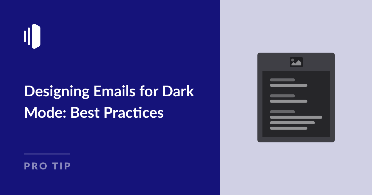
Best Practices for Designing Emails for Dark Mode
Now that we understand why dark mode matters, it’s time to get practical. By following some tried and testing tips for dark mode email design, you can avoid many of the pitfalls mentioned above.
1. Avoid Hard-Coded Background Colors
Instead of setting a specific background color, let the email client decide. This way, your email adapts to whatever mode the recipient is using.
You should also ensure your logos and images have transparent backgrounds. It prevents that awkward white box around your logo when viewed in dark mode.
Some email senders choose to set a white background for their messages, so they display as black text on a white background even if viewed in dark mode.

While this option avoids some of the headaches dark mode design, it can be frustrating for users.
2. Choose Text Colors Carefully
Getting text colors right is crucial. While standard black text is usually automatically inverted to white in dark mode, colored headings, links, and other text may not be.
Test readability in both modes. What looks great in light mode might be unreadable in dark mode, and vice versa.
You should also ensure there’s enough contrast between your text and background, whatever colors you choose. It’s not just about looking good; it’s about being readable.
3. Add Dark Mode styles
This tip is a bit more technical, but it’s worth understanding.
With a bit of CSS magic, you can make your emails adapt automatically to light and dark modes.
The prefers-color-scheme media feature is the key to actually designing for dark mode rather than just hoping your email will adjust automatically. This detects the user’s viewing preference and allows you to set individual color schemes in the CSS code for each mode.
You can even set different logos to appear in dark mode, which is ideal if your default logo is dark to avoid your emails looking like the example below with the disappearing logo.
It can also be a helpful way to avoid that white outline around images with transparent backgrounds.
4. Don’t Overlook Images
Speaking of images, the can make or break your email in dark mode. Opt for images that look good on both light and dark backgrounds and for crucial images like logos, consider creating light and dark versions.
Avoid background images entirely, as they often don’t play well with dark mode.

5. Test, Test, and Test Again
Testing is crucial, and you should ensure all your email templates are tested in both light and dark mode before sending.
Most major email clients now offer dark mode. Test your emails in Gmail, Outlook, Apple Mail, and others. What looks perfect on your screen might look very different on your recipient’s device.
Remember, designing for dark mode isn’t about creating two entirely different emails. It’s about crafting a single email that gracefully adapts to the user’s viewing preferences.
Your Turn: Step Into the Dark (Mode)
The importance of dark mode in modern email design cannot be overstated. As more and more users opt for this display setting, your ability to create emails that look great in both light and dark modes has become a crucial skill.
Now that you’re armed with these insights and best practices, I encourage you to take the plunge and design your next email with dark mode in mind. Here’s what you can do:
- Start small: Begin by implementing one or two of the best practices we’ve discussed in your next email campaign. Maybe start with optimizing your images or adjusting your color scheme.
- Test thoroughly: Test your email in various clients and modes. Remember, what looks great on your screen might look different on your recipient’s device.
- Gather feedback: Don’t be shy about asking your recipients for their thoughts. Their real-world experiences can provide invaluable insights.
Remember, creating a beautiful dark mode email is just half the battle. To make sure your masterpiece actually reaches your recipients’ inboxes, you need a reliable email delivery service.
SendLayer ensures your transactional emails get delivered quickly and reliably, so all your hard work on dark mode design doesn’t go to waste.
That’s it! Now you know all about designing emails for dark mode.
Next, would you like to learn about the benefits and disadvantages of no-reply email addresses? Check out our article on no-reply email pros and cons for more information.