Are you looking for ideas on how to improve the design of your transactional emails?
Transactional emails are a critical part of the customer’s experience with your brand. They’re essential for communicating important information and, if designed carefully, can be an effective way to drive more sales, reinforce brand loyalty, and build relationships with your customers.
Unfortunately, most businesses and website owners don’t put a lot of thought into transactional email design, and so miss out on this opportunity to connect with an engaged user.
In this article, we’ll offer some actionable tips on improving your transactional emails from the content to the design. We’ve also included some examples of transactional emails that demonstrate these best practices.
What Is Transactional Email?
Transactional emails are automated messages that are sent from a website, usually triggered by a user action such as signing up as a member, making a purchase, or registering for a newsletter.
These email messages contain important information such as account information, password reset links, and order confirmations. Because the user usually needs this information quickly, transactional emails have higher open rates than marketing emails or other types of emails.
Savvy marketers and business owners can take advantage of this high open rate by using their transactional email templates to reinforce their branding and values, strengthen customer relationships, and encourage users to click through to the website to take further action.
How To Improve Transactional Email Design
While payments and orders immediately spring to mind when you hear the word “transactional”, transactional emails are not limited to eCommerce sites.
When we’re talking about transactional emails, these can be triggered by any kind of user ‘transaction’ with the site or pre-set automation, not just a financial one.
We’ve listed some of the most common types of transactional emails, along with some ideas on how you may be able to improve the emails that are automatically sent from your website.
Welcome Emails
Welcome emails are messages sent when a user registers on a website or signs up for a newsletter.
At their most basic level, welcome emails act as a confirmation that the registration was successful. And sometimes these emails contain nothing else than a simple confirmation message along with links for basic account management, such as this welcome email from X.
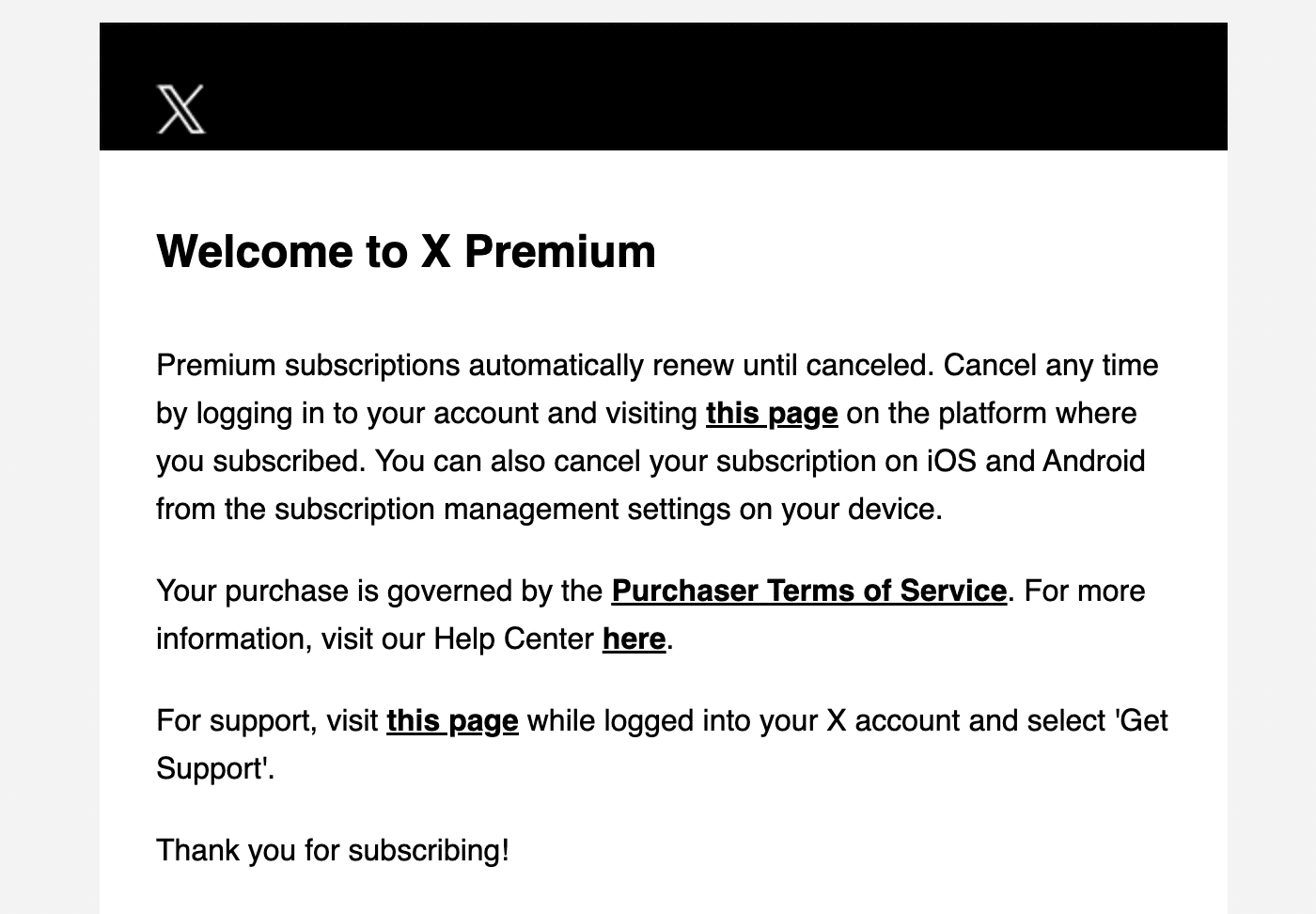
While there’s nothing wrong with this simple approach, the welcome email is often a user’s first direct interaction with your brand, so it’s a great opportunity to make a good first impression.
As well as paying careful attention to the branding of your welcome emails, personalization can be particularly effective in welcome emails to start building a rapport with your audience.
Depending on the type of website or business you run, you could also use these emails to direct users to useful sections of your website or perhaps offer them a welcome discount or coupon code to be used on their first order.
This welcome email from Asian beauty eCommerce brand Sociolla is a great example of how to make the most out of your welcome emails:
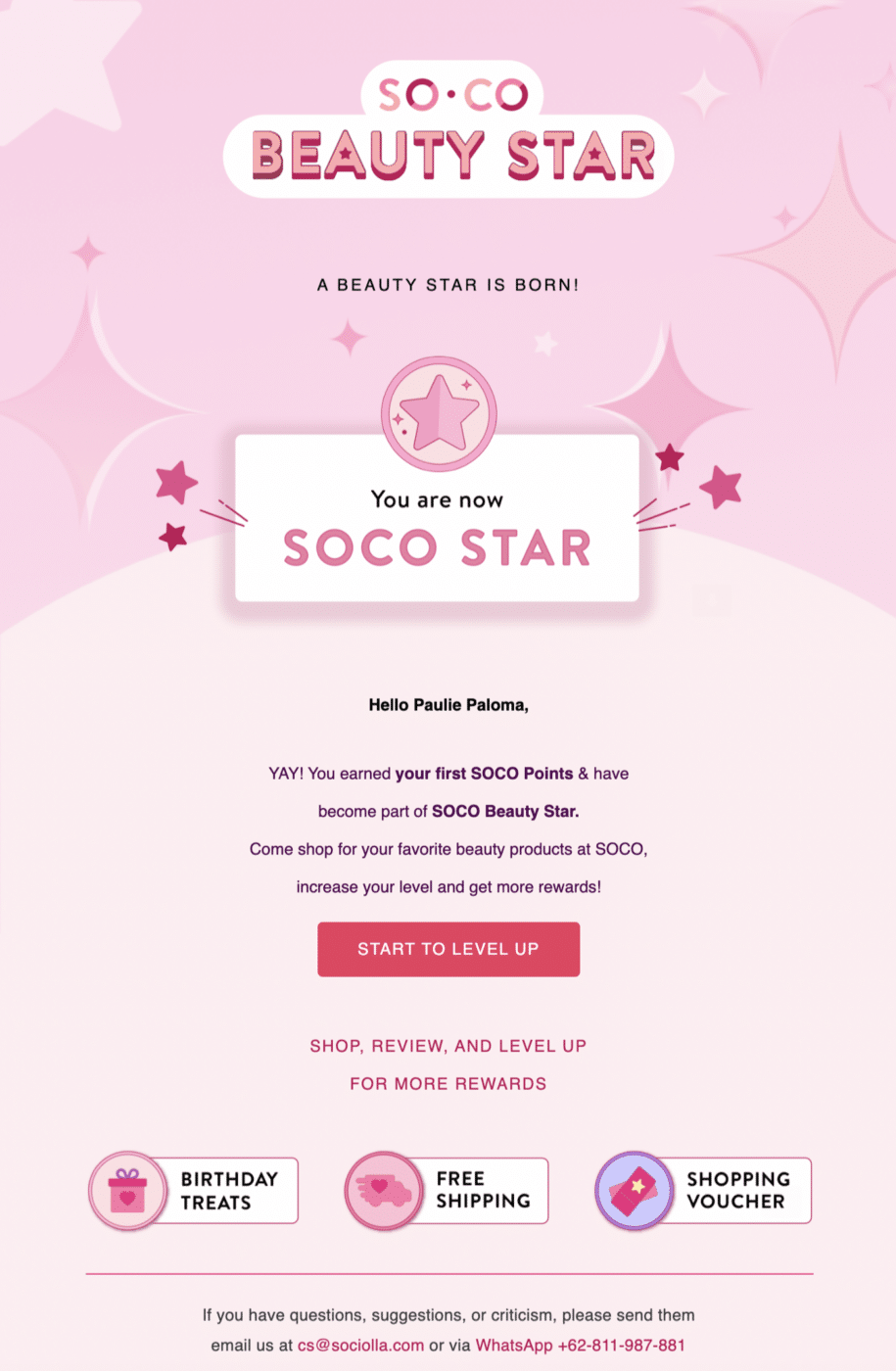
As well as reinforcing the branding with the design of the email, there are a few ideas here that you may want to consider using in your own welcome emails:
- Personalization and community feel: This welcome email truly feels welcoming by going one step further than just including the recipient’s name, and also crowning them as a “Soco Star”. This is a fantastic way to make your customers feel special and welcome them in as part of your community.
- Drive sales: Drawing attention to perks such as free shipping, vouchers, and other bonuses, your welcome emails are more likely to convert subscribers into customers.
Order Confirmations
Order confirmation emails are sent out automatically when a customer makes a purchase on an eCommerce site.
The main purpose of these emails is to confirm the details of the order such as the items ordered, delivery address, and the total paid. But they often contain other useful information such as links to track shipping, edit the order, and contact customer service.
A basic order confirmation email will look something like this:
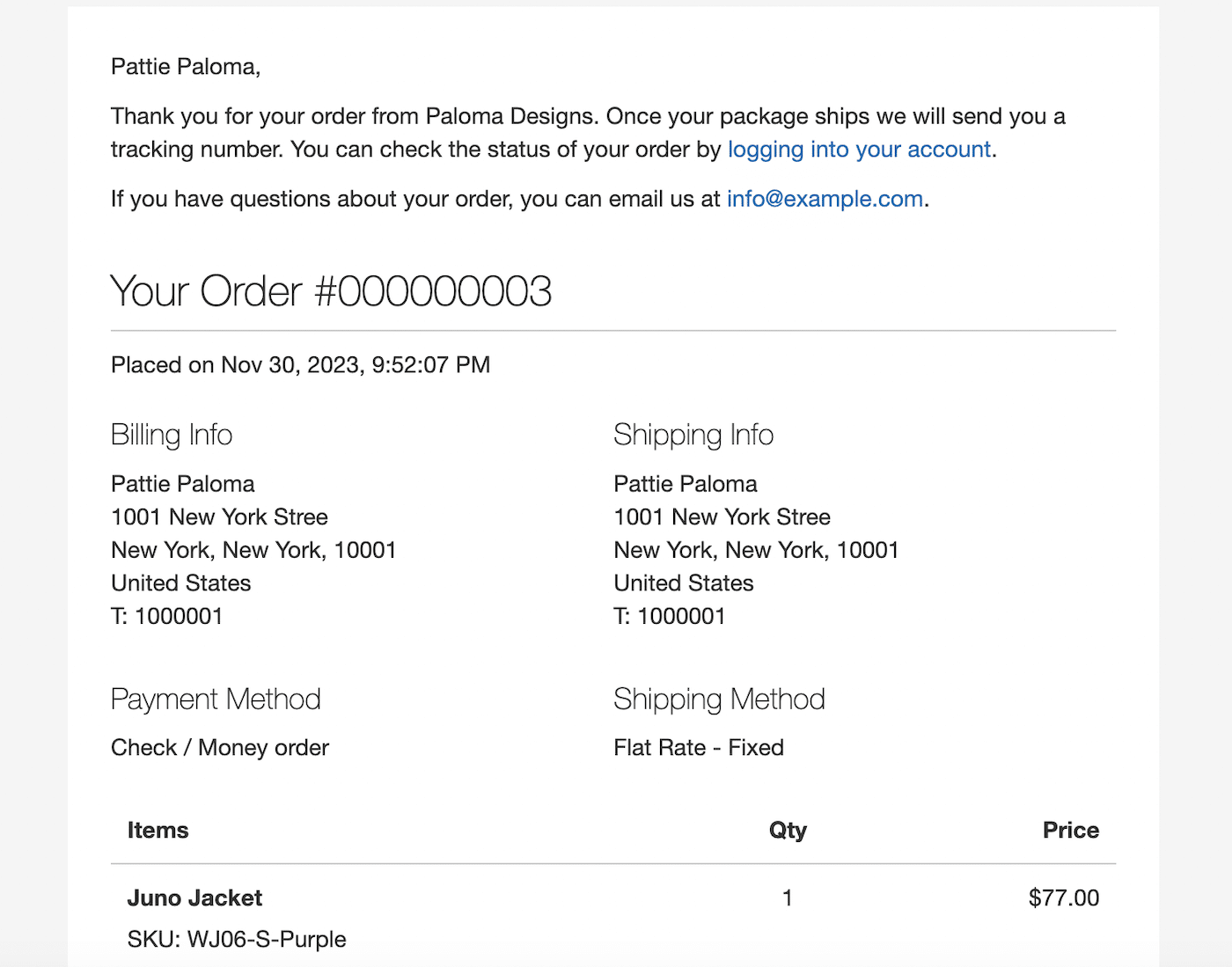
It’s a good idea to keep it simple when it comes to order confirmations.
These emails should include all the relevant information relating to the order including:
- Customer name
- Order number
- Date of order
- Shipping address
- Billing address
- Payment method
- Shipping method
- Items ordered
- Price of each item, including discounts
- Total order value
While you don’t want to go over the top with fancy designs for your order confirmations, you should include your basic branding elements such as your logo and brand colors. Emails without any branding at all seem unprofessional and may cause concern with customers that they did not order from a legitimate website.
This email from online florist Bloom and Wild is a great example of a well-designed order confirmation email:

There are a few things to take note of here that you might want to replicate when you create order confirmations for your online store:
- A picture of the product: As well as clear information confirming the details of the order, a clear picture allows for visual confirmation that the order is correct.
- Delivery information: As well as giving an estimated delivery date, there’s information on how to contact customer service if the order doesn’t arrive when expected.
- What happens next: Customers know exactly what to expect when you inform them when you will be contacting them again. This can cut down on unnecessary emails and support requests.
- Discount code for next order: Encourage repeat orders by including a discount code and direct links to other products they may be interested in.
Shipping Confirmation Emails
Shipping notification emails are sent once an order has left the seller and often contain tracking information and estimated delivery dates.
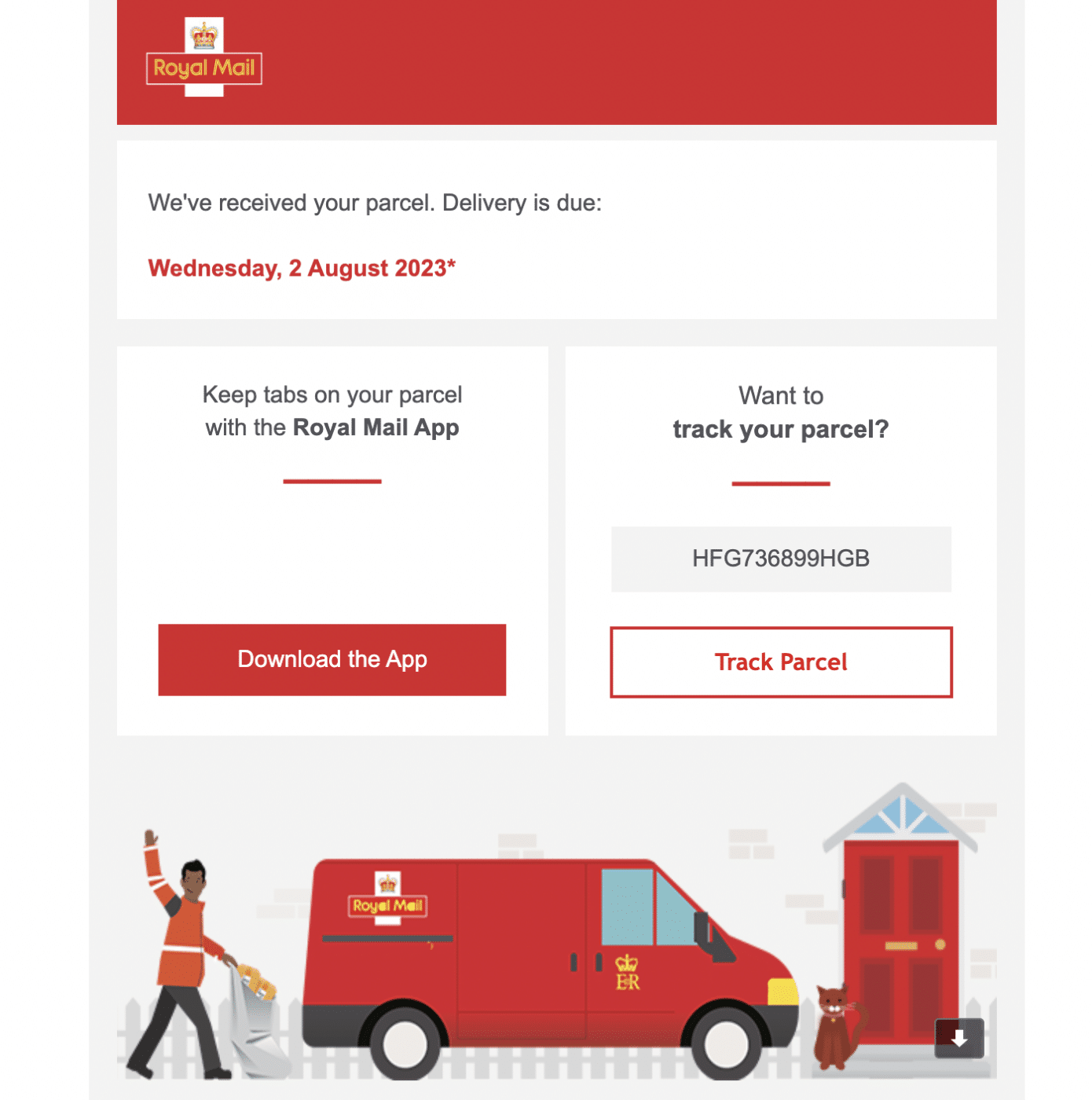
This shipping confirmation email gives a clear link to track the delivery but also encourages the reader to download the app. The design of the email is clean but includes attractive graphics and colors to reinforce the brand messaging.
Abandoned Cart Emails
Abandoned cart emails are triggered when a customer adds items to their cart but does not check out.
These emails are a fantastic way to boost sales. Focusing on abandoned cart recovery has been shown to increase the conversion rate of eCommerce sites from 2-3% to 10% or more.
This abandoned cart email from beauty brand Sephora is a good example of how you can entice customers back with a simple, automated email:
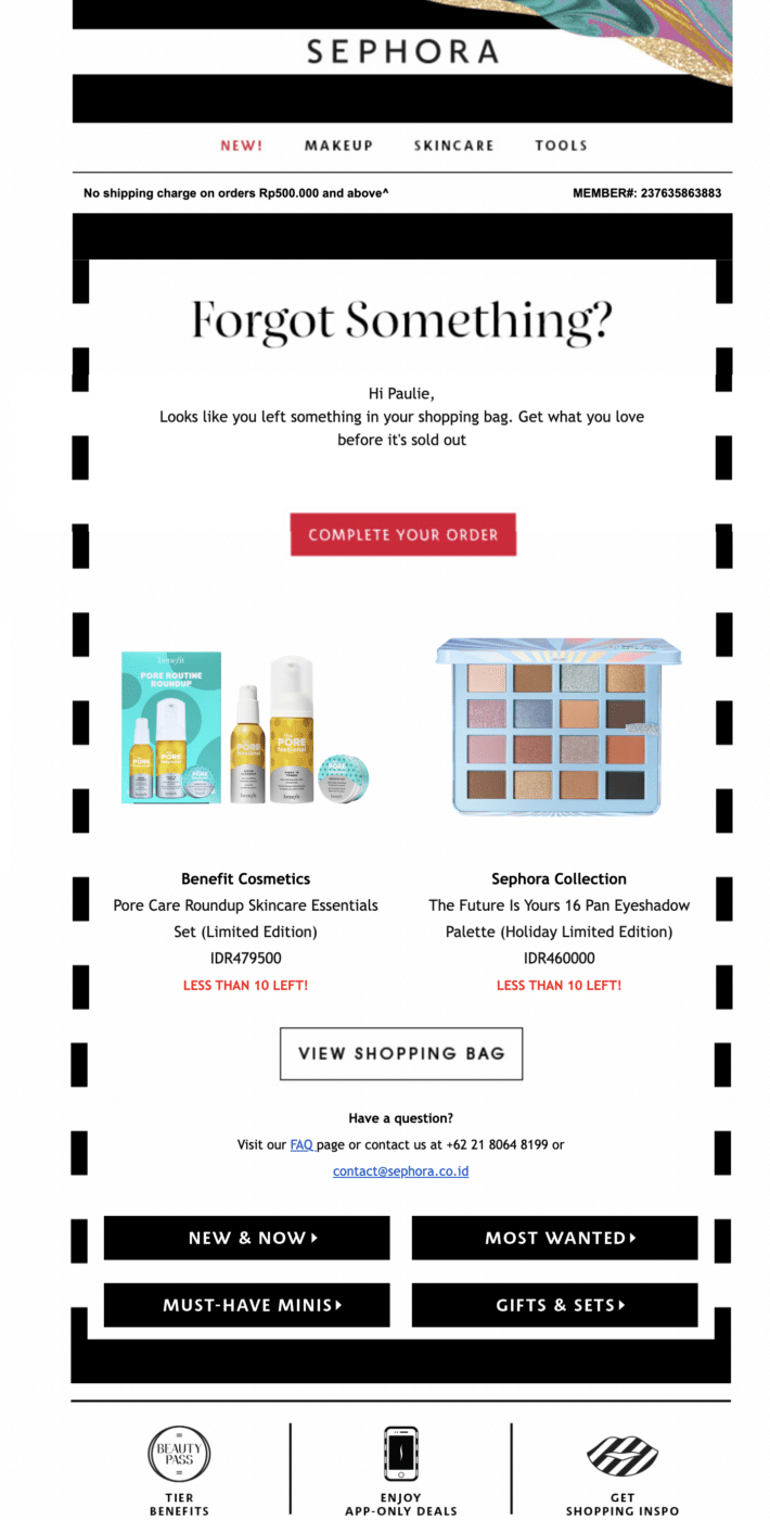
- Images of products: Text alone is often not enough. Images act as a clear reminder of the products the customer is considering purchasing.
- Low stock warning: The red text exclaiming “less than 10 left!” is a great way to instill fear of missing out (FOMO) in your customers and prompt them to complete the sale sooner rather than later.
- Clear links to customer service: Customers sometimes delay completing an order because they’re unsure about something. Encouraging them to get in touch and ask questions can help them complete the sale and improve the customer experience.
Although not included in this example, including a discount code or other special offer can be an effective way to coax reluctant customers into a sale.
Password Reset Emails
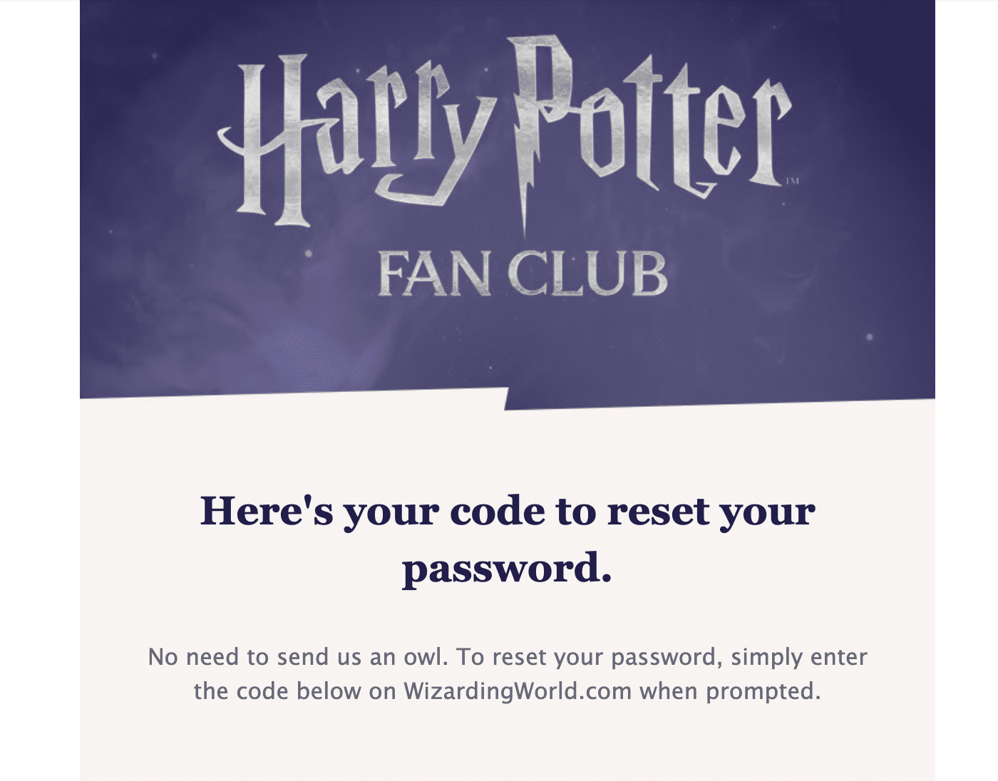
Users requesting a password reset email are often already frustrated, so including the link without any additional unrequested information or marketing messages is a wise course of action.
However, employing a little humor in the copy like this example can go a long way towards reinforcing your branding and building relationships with your users.
Double Optins
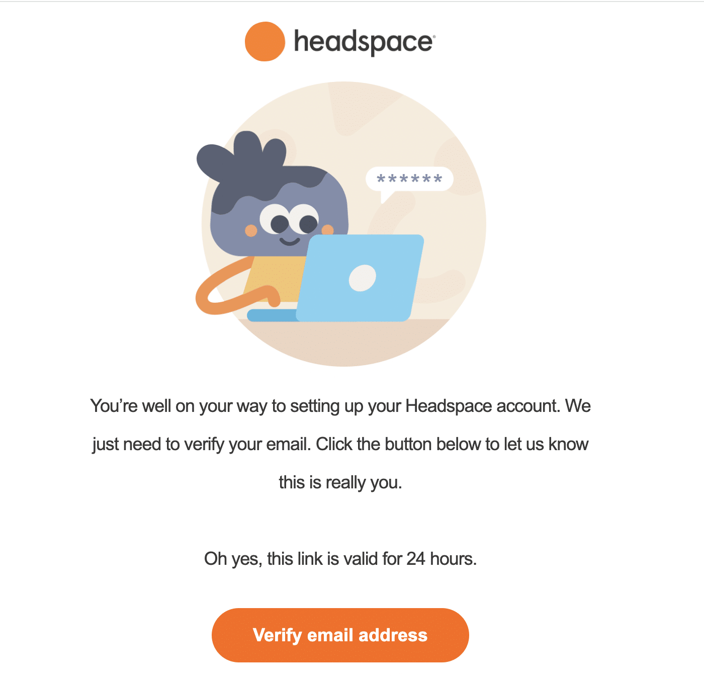
Using a double optin when users sign up to your mailing list is one of the recommended marketing email best practices to keep your bounce rate low and ensure that only engaged users are on your list.
For these emails, it’s important to include minimal content and make the CTA very clear to maximize the click-through rate.
Cancelation Emails
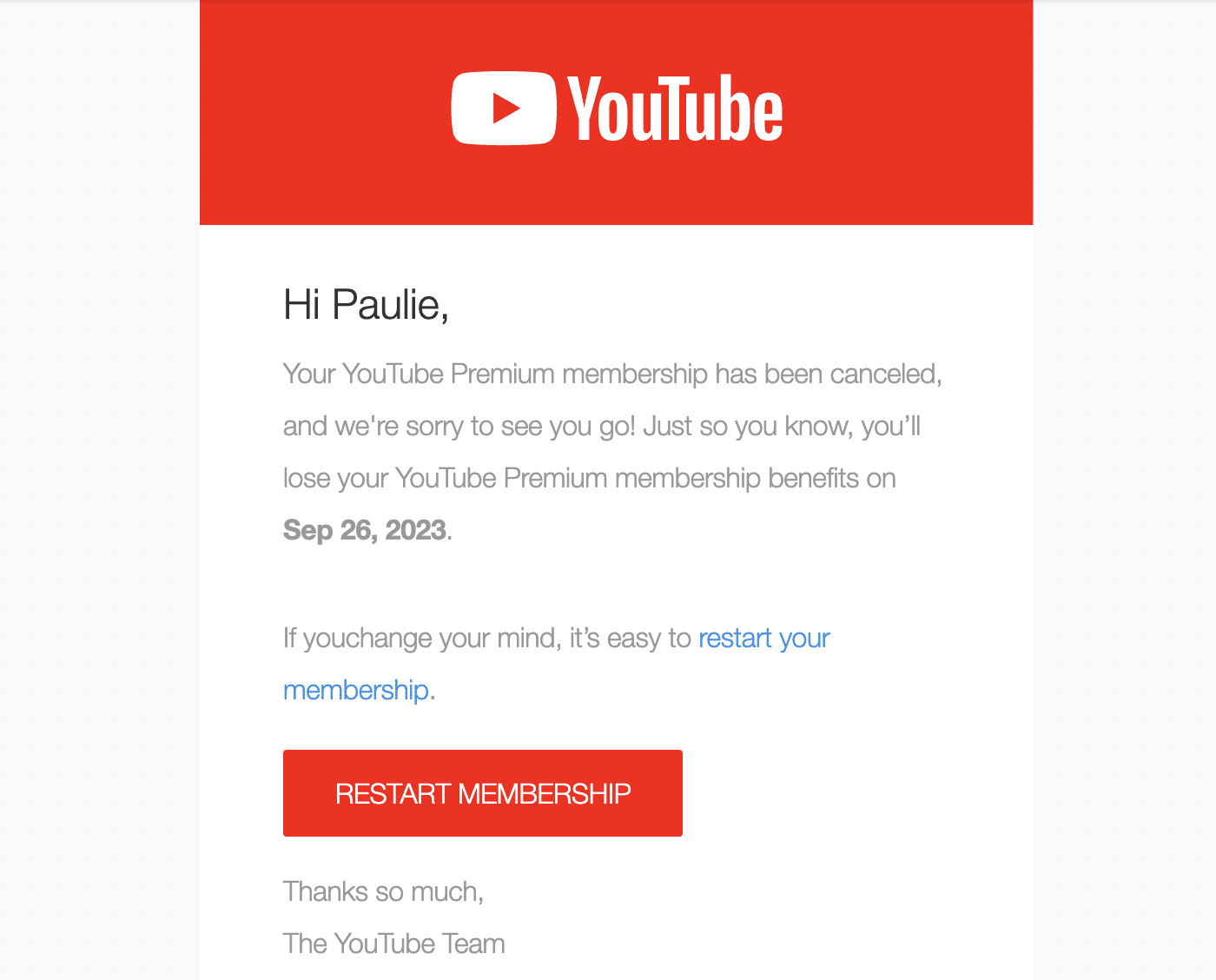
When a customer cancels a subscription or closes their account, it’s important to send an email confirming this action has been completed.
This email can also be an opportunity to stay on good terms with the customer and potentially win them back. Make sure to include a link for them to reinstate their account in case they have canceled by accident or the cancelation was caused by a payment failure.
Transactional Email Design and Content Best Practices
Looking for tips to improve your transactional emails? Follow these best practices when you’re building your transactional emails to ensure you make the most out of every interaction with your users and customers.
Be Clear and Concise
The key to effective transactional emails is clarity. Keep your content focused and to the point. Avoid overloading the email with unnecessary information that might detract from the main message.
Make sure the primary purpose of your email is obvious at a glance. Whether it’s an order confirmation, a password reset, or a shipping update, the recipient should understand the email’s intent from both the subject line and the first few lines of the body of the email.
Be Consistent In Your Brand Messaging
Incorporate your brand’s logo, color scheme, and other visual elements into the design. This not only increases brand recognition but also lends a professional touch to your emails.
If your app is built with frontend frameworks like React.js, you can create modern transactional email templates using a library like React.Email.
The tone of your transactional emails should also be consistent with your overall brand voice. Whether formal, friendly, or somewhere in between, use every email as an opportunity to reinforce your brand voice.
If you don’t have copywriting experience and don’t have the budget for a professional copywriter, you can write email content with AI assistance, which can help you to maintain a consistent tone.
Utilize Personalization
Addressing the recipient by name adds a personal touch to your transactional emails and can help to increase engagement. Using the recipient’s purchase history and other information can also help to make emails more relevant and useful.
Include Clear Calls to Action
Not all transactional emails require the user to take action, but for those that do, it’s vital to draw attention to the specific action you want them to take, whether it’s “Track Your Order” or “Reset Your Password.” Make sure your CTA is clearly visible in the form of a button or larger font in a contrasting color that is set apart from the main content of the email.
Place your CTA in a prominent position within the email. It should be easily visible without requiring the recipient to scroll too much.
Ensure Your Emails Are Mobile-Friendly
With the increasing use of mobile devices to check emails, it’s crucial that your emails are clear and easy to read at any screen size. Utilize responsive HTML design and test your emails on various devices and email clients to ensure they look good and function well everywhere.
Use a Dedicated SMTP Delivery Service
To ensure your emails consistently reach the inbox, use an SMTP email delivery service like SendLayer. This enhances the reliability of your email delivery and helps maintain your sender reputation.
A transactional email service like SendLayer can also help in avoiding spam filters, ensuring that your important transactional messages are not missed.
Monitor Delivery and Open Rates
Email marketing platforms have built-in reporting tools for keeping track of your promotional emails and email marketing campaigns but you may not have a system in place for monitoring your transactional emails.
However, it’s just as important (if not more so) to know if your transactional emails aren’t being delivered or the recipients aren’t reading them.
If you’re using a transactional email provider like SendLayer, you can monitor the status of all the emails sent from your site. This way you can know immediately if there is a deliverability problem with your emails and do some investigation to figure out what the issue is.
That’s it! Now you know how to improve transactional email design.
Next, would you like to learn about domain reputation? Check out our guide on domain reputation and how to improve it to ensure your transactional emails always reach the inbox.
