Every abandoned cart represents a potential sale waiting to be recovered.
With the right abandoned cart email strategy, you can turn those almost-sales into actual revenue. Studies show that well-crafted abandoned cart emails can typically recover 5% to 10% of lost sales.
In this guide, I’ll give you some tips to make your abandoned cart emails more effective and show you some examples of brands that are already succeeding at recovering lost sales.
- What Makes a Great Abandoned Cart Email?
- Best Abandoned Cart Email Examples
- 1. Adidas: Cart Recovery with a Humorous Twist
- 2. Headspace: Mindful Approach to Cart Recovery
- 3. Cotopaxi: Adventure-Ready Cart Recovery
- 4. Nike: Minimalist Motivation for Cart Recovery
- 5. Fender: Custom Guitar Cart Recovery That Strikes a Chord
- 6. Luno: Adventure-Ready Cart Recovery
- 7. Grove Co.: Eco-Friendly Cart Recovery With a Gift
- 8. Le Tote: Stylish Solution to Cart Abandonment
- 9. LNER: Destination-Driven Cart Recovery
- 10. Society6: Artful Cart Recovery
- 11. Taco Bell: Playful Fast-Food Cart Recovery
What Makes a Great Abandoned Cart Email?
Creating an effective abandoned cart email isn’t just about reminding customers they left something behind – it’s about helping to overcome their concerns and motivating action.
While there’s no one-size-fits-all formula, successful abandoned cart emails consistently nail several key elements.
Deliverability First
Get your recovery emails into inboxes, not spam folders. Start with a reliable transactional email provider that prioritizes deliverability.
Timing is Everything
The moment a customer abandons their cart, a countdown begins.
The first hour is crucial – this is when purchase intent remains highest and customers are most likely still in shopping mode.
Sending your initial recovery email within this golden hour can address any immediate concerns or technical issues that may have caused the abandonment.
Psychology that Converts
Consumer psychology plays a vital role in successful cart recovery. Urgency and scarcity are powerful motivators – showing real-time inventory levels or highlighting limited-time offers can create FOMO (fear of missing out) that drives action.
Social proof helps validate the customer’s initial interest. Incorporating product ratings, reviews, and user-generated content can reinforce their original purchase intent.
Loss aversion is another powerful trigger – reminding customers what they’ll miss out on, whether it’s a special price or a popular item that might sell out, can be more motivating than highlighting what they’ll gain.
Strategic Incentives
Discounts and offers can sometimes be enough to push a customer who was on the edge about buying something into making the sale.
Free shipping often performs better than percentage-based discounts, as it removes a common friction point in the purchase process.
Whatever incentive you choose, make it time-sensitive with clear expiration dates, and ensure the redemption process is simple and straightforward.
Make It Easy
With most emails now opened on mobile devices, your abandoned cart emails must be optimized for smaller screens. Images should load quickly while maintaining quality, and text should be easily readable without zooming.
The path back to the cart needs to be frictionless – ideally achievable with a single tap, and the checkout process should be as quick and simple as possible.
Personalization Elements
Generic recovery emails simply don’t perform as well as personalized ones. Use customer data intelligently to create relevant, tailored messages.
This goes beyond just using the customer’s name – reference their browsing history, acknowledge their customer status, and segment based on cart value and abandonment frequency. The more relevant your email feels, the more likely it is to drive action.
Clear Call-to-Action
Your recovery email should have one primary goal: getting customers back to their cart.
Make this action obvious with a prominent, well-designed button. The button text should be action-oriented and specific – “Return to Your Cart” or “Complete Your Purchase” work better than generic phrases like “Click Here.”
Best Abandoned Cart Email Examples
Ready to turn those lost sales into revenue? Let’s take a look at some outstanding abandoned cart emails that masterfully combine psychology, timing, and compelling offers to win back hesitant shoppers.
These examples showcase how leading brands turn potential losses into successful recoveries.
1. Adidas: Cart Recovery with a Humorous Twist
Abandoned cart emails don’t have to be boring reminders or desperate pleas to come back. Adidas demonstrates how to strike the perfect balance between casual conversation and strategic selling in this cleverly crafted recovery email.
Instead of pushing for an immediate sale, they lead with a humorous Wi-Fi check-in that feels more like a friend following up than a brand pushing for conversion.

Why It Works:
- Clever Psychology The “Is Your Wi-Fi Okay?” headline uses humor to address abandonment without being pushy, making the email feel helpful rather than salesy.
- Strong Social Proof The “WHAT’S THE WORD?” section combines user-generated photos with authentic reviews and ratings, building confidence in the purchase decision.
- Clear Visual Hierarchy Large product image, easily tappable buttons, and clean layout make the email highly effective on mobile devices.
- Multiple Recovery Paths Offers both direct purchase (“SHOP NOW”) and customization options, catering to different customer preferences.
- Value-Driven Content Emphasizes the “iconic” status and versatility of the product through lifestyle imagery and customer testimonials.
Key Takeaway: Humor and authenticity can transform a standard cart recovery email into an engaging brand touchpoint. By combining a light-hearted approach with strong social proof, Adidas creates urgency without being aggressive.
2. Headspace: Mindful Approach to Cart Recovery
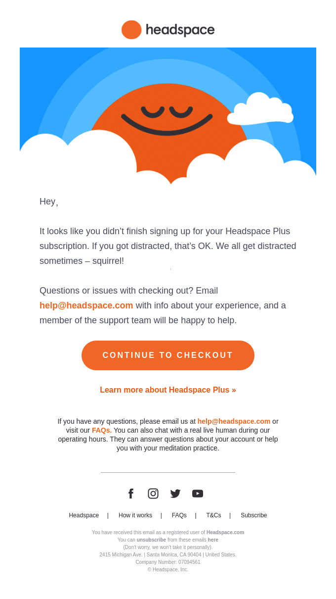
When it comes to abandoned subscriptions for mindfulness and meditation, your recovery email better practice what you preach.
Headspace masterfully demonstrates how to align recovery tactics with brand values, using a calm, understanding tone that mirrors their product experience.
Why It Works:
- Perfect Brand Voice The playful “squirrel!” distraction reference and understanding tone perfectly match Headspace’s friendly, mindful brand personality.
- Personal Touch Uses the customer’s name and acknowledges that getting distracted is perfectly normal, creating an empathetic connection.
- Clear Support Options Multiple support channels are offered, including email, FAQs, and live chat during operating hours, removing any barriers to completion.
- Simple Design Clean, uncluttered layout with their signature illustration style maintains brand consistency while keeping the focus on the message.
- Strategic CTAs Both direct (“CONTINUE TO CHECKOUT”) and educational (“Learn more about Headspace Plus”) options cater to different stages of decision-making.
Key Takeaway: Recovery emails should reflect your brand’s core values. Headspace’s gentle, understanding approach shows how to turn an abandonment follow-up into an extension of your product experience.
3. Cotopaxi: Adventure-Ready Cart Recovery
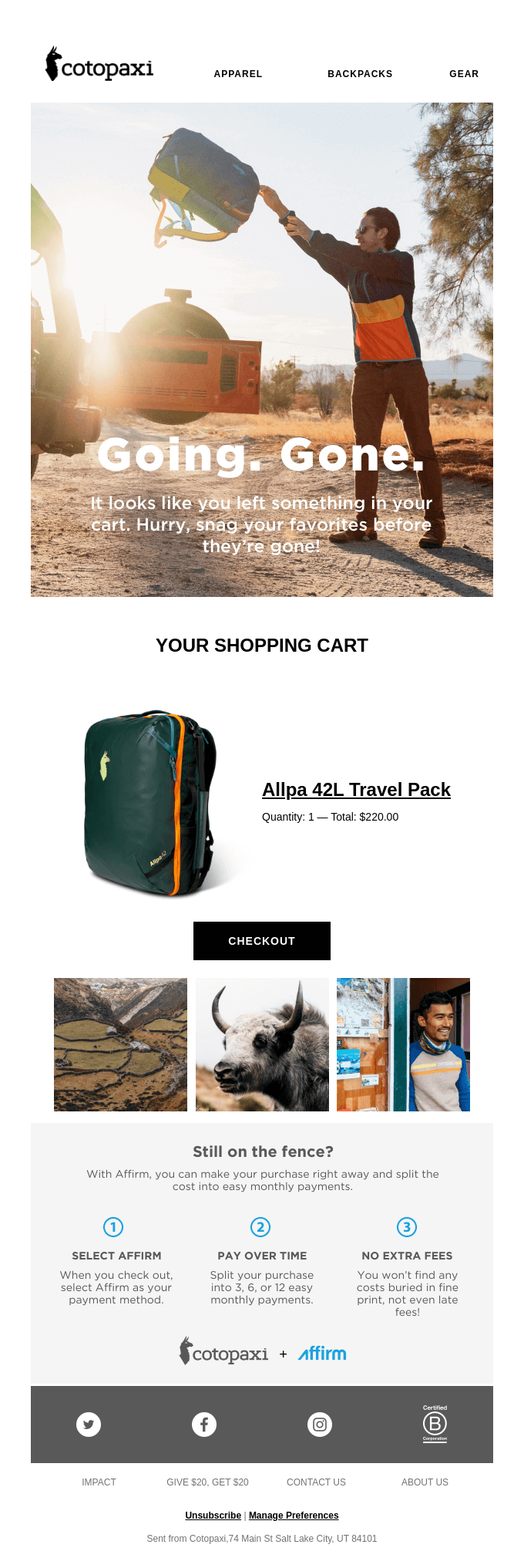
Cotopaxi’s abandoned cart email captures the adventurous spirit of their brand while creating a sense of urgency that feels authentic to their outdoor-focused audience.
Like their colorful gear, this email combines functionality with a bold, distinctive style.
Why It Works:
- Compelling Imagery Hero image of an adventurer in action immediately connects with their target audience’s lifestyle aspirations and showcases their gear in use.
- Strategic Urgency “Going. Gone.” headline paired with “Hurry, snap your favorites before they’re gone!” creates FOMO without being aggressive.
- Clear Cart Preview Shows the abandoned item with clear pricing and quantity, making it easy for customers to remember what they left behind.
- Financial Flexibility Addresses cost concerns by highlighting Affirm payment options with a clear, three-step breakdown of the process.
- Visual Social Proof Lifestyle imagery at the bottom reinforces the brand’s outdoor credentials and community connection.
Key Takeaway: By combining urgency with payment solutions and aspirational imagery, Cotopaxi creates a recovery email that feels less like a reminder and more like an invitation to adventure.
4. Nike: Minimalist Motivation for Cart Recovery
Nike brings their signature “Just Do It” mentality to cart recovery with a streamlined, confident approach. The email mirrors their product design philosophy: clean, purposeful, and focused on performance, while adding value through membership benefits.

Why It Works:
- Minimalist Design Clean, uncluttered layout with plenty of white space keeps the focus on the abandoned product and recommended items.
- Strategic Incentives Leads with “Up to 40% Off” and free shipping for Nike Members, creating immediate value without being pushy.
- Trust Building Features Highlights member benefits like expert advice and 60-day free returns, addressing common purchase hesitations.
- Smart Product Recommendations “You may also like” section shows complementary items, potentially increasing cart value while providing style inspiration.
- Confidence Building “Almost there” headline and “Get Real Advice From Real Experts” section provide reassurance and support throughout the purchase journey.
Key Takeaway: Nike shows how a minimalist approach combined with strong membership benefits can create a compelling recovery email that feels more like a VIP service than a sales reminder.
5. Fender: Custom Guitar Cart Recovery That Strikes a Chord
Fender’s Mod Shop cart recovery email hits all the right notes by understanding that custom instrument purchases require both financial flexibility and purchase confidence.
Their approach acknowledges the significant investment while providing solutions to complete the sale.

Why It Works:
- Financial Solution First Leads with “PLAY NOW. PAY LATER.” messaging and Klarna financing options, addressing the primary barrier for high-ticket purchases.
- Custom Build Emphasis “YOUR JAZZ BASS IN THE MAKING” reminds customers of their personalized creation, adding emotional investment to the recovery attempt.
- Trust Building Features Highlights warranty, hardshell case, and inspection process, addressing quality concerns for custom instruments.
- Clear Support Access Provides direct contact information with extended hours, showing they’re ready to help complete the custom order.
- Simple Design Clean, black and white layout with red accents matches Fender’s premium brand while keeping the focus on the custom instrument.
Key Takeaway: When recovering abandoned high-value, custom orders, addressing financial barriers while reinforcing product quality and support can effectively rebuild purchase confidence.
6. Luno: Adventure-Ready Cart Recovery
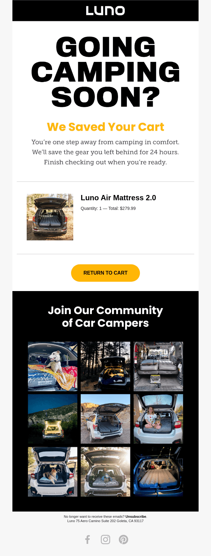
Luno crafts a cart recovery email that speaks directly to their outdoor audience’s immediate needs while building community connection.
Their approach combines practical urgency with aspirational lifestyle content perfectly suited for their car camping audience.
Why It Works:
- Contextual Headline “GOING CAMPING SOON?” creates immediate relevance and suggests timing urgency without being pushy.
- Clear Cart Status Transparently communicates the 24-hour cart save window, creating gentle urgency while being helpful.
- Community Building Grid of user-generated photos showcases real customers enjoying their products, building trust and FOMO simultaneously.
- Simple Recovery Path Single, prominent “RETURN TO CART” button in brand colors makes the next step obvious.
- Product Context Shows the abandoned item in a lifestyle setting, helping customers visualize their own camping experience.
Key Takeaway: By combining practical purchase information with community-driven social proof, Luno creates a recovery email that feels less like a reminder and more like an invitation to join fellow adventurers.
7. Grove Co.: Eco-Friendly Cart Recovery With a Gift
Grove Co. masterfully combines sustainability messaging with an attractive incentive in their cart recovery email.
Their approach emphasizes both immediate value and long-term environmental impact, perfectly aligned with their conscious consumer base.

Why It Works:
- Leading With Value Opens with a compelling “free gift set” offer, creating immediate urgency without being pushy about the abandoned cart.
- Trust Building Standards “Feel Good Cleaning Standard” section highlights key differentiators like ingredient standards and carbon neutral commitment.
- Clear Product Navigation Well-organized category menu makes it easy to continue shopping or explore other sustainable options.
- Environmental Commitment Reinforces brand values with Beyond Plastic™ certification and sustainability messaging.
- Visual Appeal Clean, aqua-themed design with professional product photography reinforces the brand’s natural, premium positioning.
Key Takeaway: By leading with a gift offer while reinforcing environmental commitments, Grove Co. creates a recovery email that feels more like a welcome to sustainable living than a sales reminder.
8. Le Tote: Stylish Solution to Cart Abandonment
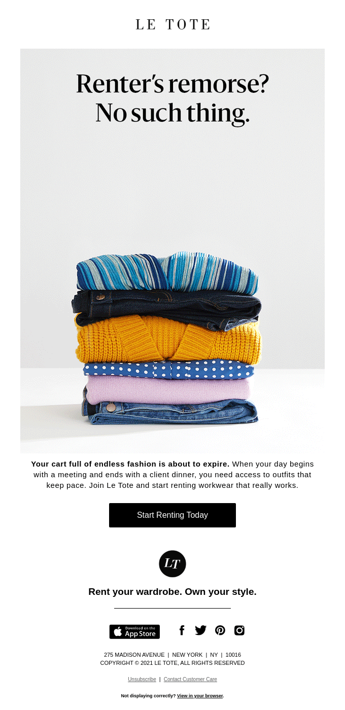
Le Tote takes a unique approach to cart recovery by directly addressing a common hesitation – buyer’s remorse – and turns it into a compelling value proposition. Their minimal design lets the message and imagery do the heavy lifting.
Why It Works:
- Clever Copywriting “Renter’s remorse? No such thing.” headline cleverly addresses and dismisses a key objection to clothing rental.
- Lifestyle Context Copy about “meeting to client dinner” scenarios helps customers visualize how the service fits their busy professional lives.
- Strong Visuals Clean product styling of neatly folded, color-coordinated clothing implies organization and quality in their rental service.
- Clear Value Proposition “Rent your wardrobe. Own your style.” tagline perfectly encapsulates the service’s main benefit in a memorable way.
- Minimalist Design Simple, premium layout with plenty of white space reflects the sophisticated audience they’re targeting.
Key Takeaway: By acknowledging and dismissing common objections while showcasing their service’s practical benefits, Le Tote creates a recovery email that feels more like helpful advice than a sales pitch.
9. LNER: Destination-Driven Cart Recovery
London North Eastern Railway (LNER) crafts a cart recovery email that combines wanderlust with practical value propositions.
Their approach targets both the emotional appeal of London travel and the rational concerns about train booking.
Why It Works:
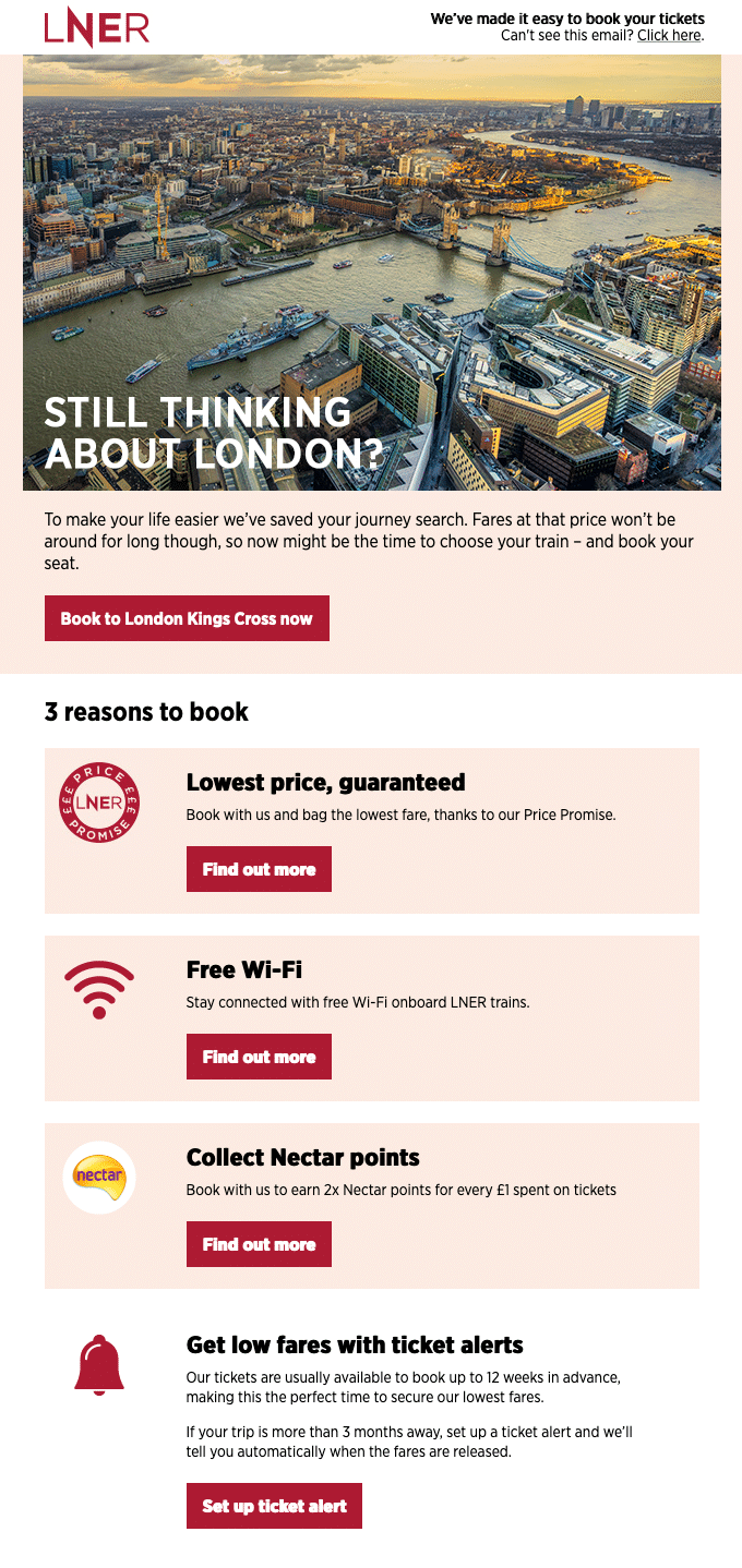
- Aspirational Imagery Stunning aerial view of London with Tower Bridge creates immediate emotional connection and travel desire.
- Urgency Creation Subtle pricing pressure with “Fares at that price won’t be around for long” creates urgency without aggressive tactics.
- Value Stacking Clear “3 reasons to book” section breaks down multiple benefits including price guarantees, Wi-Fi, and loyalty points.
- Future Planning Smart inclusion of ticket alert feature helps customers who might be researching future travel dates.
- Trust Building Price Promise guarantee and loyalty program integration builds confidence in the booking process.
Key Takeaway: By combining destination inspiration with practical booking benefits, LNER creates a recovery email that serves both immediate bookers and future planners effectively.
10. Society6: Artful Cart Recovery
Society6 demonstrates how to turn cart recovery into an aesthetically pleasing experience that aligns perfectly with their artistic marketplace.
Their email combines clear urgency with visual inspiration that speaks to their design-conscious audience.
Why It Works:
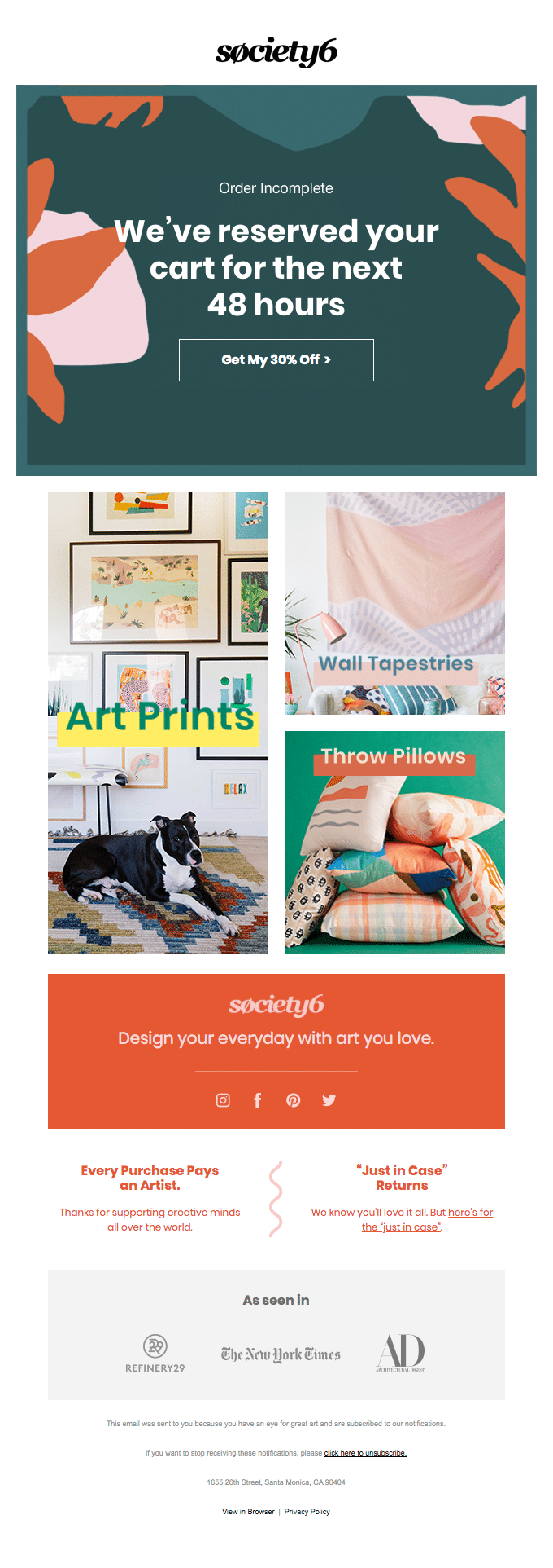
- Clear Timing Window Immediately communicates the 48-hour cart reservation, creating urgency while being helpful.
- Strong Incentive Leads with a compelling 30% off offer that adds immediate value to complete the purchase.
- Visual Categories Uses lifestyle photography to showcase different product categories (Art Prints, Wall Tapestries, Throw Pillows) in context.
- Mission Driven Emphasizes artist support with “Every Purchase Pays an Artist” messaging, adding ethical value to the purchase.
- Trust Building Features press credentials from major publications and a clear returns policy to build confidence.
Key Takeaway: By combining time-sensitive offers with artistic presentation and ethical messaging, Society6 creates a recovery email that feels more like a curated gallery invitation than a sales reminder.
11. Taco Bell: Playful Fast-Food Cart Recovery
Taco Bell brings their quirky brand personality to cart recovery with a fun, illustrated approach that makes hungry customers smile.
Their email perfectly balances humor with hunger-inducing messaging to drive immediate action.
Why It Works:
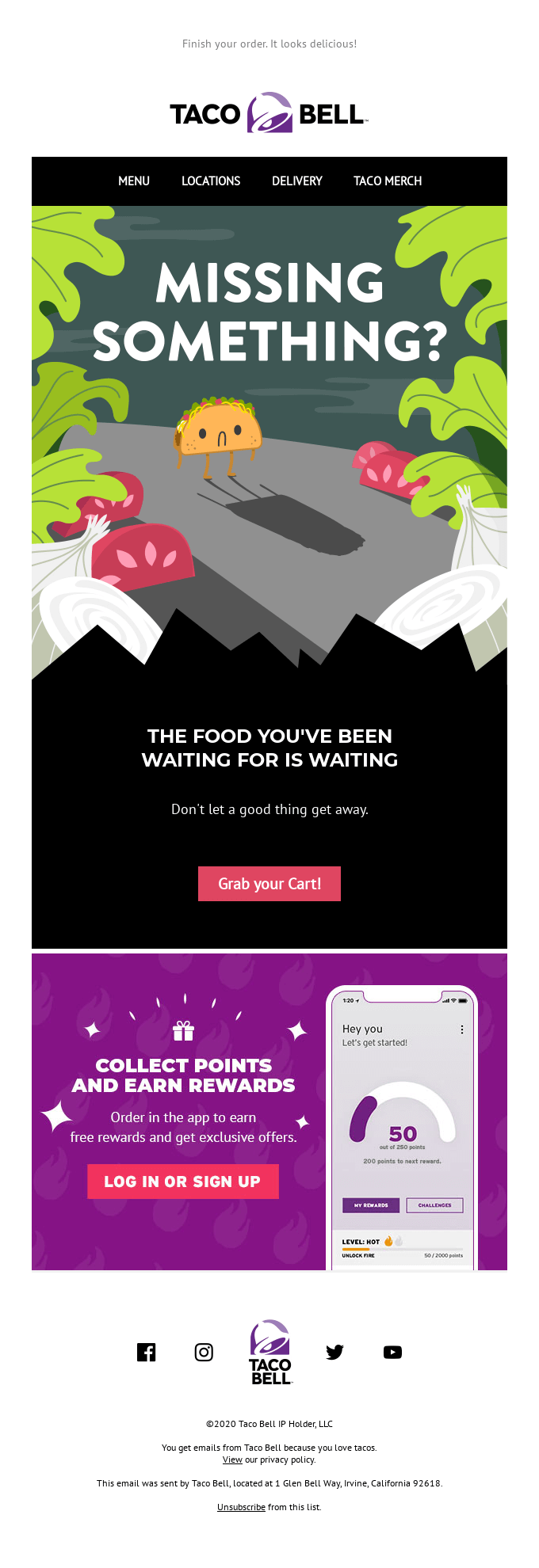
- Playful Design Custom illustration of a sad taco casting a shadow creates an emotional connection while staying on-brand with their fun personality.
- FOMO Messaging “Don’t let a good thing get away” creates subtle urgency without being pushy about the abandoned cart.
- Clear Value Add Highlights rewards program and app benefits, offering additional incentive to complete the purchase.
- Simple Navigation Clean menu bar at top makes it easy to browse alternatives or find nearby locations.
- Direct CTA “Grab your Cart!” button uses action-oriented language that speaks to immediate food cravings.
Key Takeaway: By using playful design and hunger-triggering messaging, Taco Bell transforms a standard cart recovery email into a craving-inducing reminder that feels both fun and urgent.
That’s it! Now you know how to craft an effective abandoned cart email
Next, would you like to see more transactional email examples? Check out our roundup of the best welcome email examples for new customers for more inspiration and ideas.
