Imagine getting an important email—perhaps critical information about a new account or an order update that requires immediate attention—and not being able to read it.
While marketing emails might be skimmed or skipped, transactional emails often contain information that users must be able to read and act on immediately. When a customer needs to verify their identity, track a package, or check a receipt, email accessibility isn’t just about convenience—it’s about ensuring everyone can fully use your service.
First Things First: Getting Your Emails Delivered
Before we look at making your transactional emails accessible, let’s address the foundation: email deliverability.
Even the most perfectly crafted, accessible email won’t help your users if it never reaches their inbox. Transactional emails are too important to risk getting caught in spam filters or delayed in delivery queues.
SendLayer helps improve deliverability by using a robust email infrastructure, trusted sending domains, handling bounces automatically, and providing real-time delivery insights. This means your important emails are more likely to land where they should—so you can focus on making them user-friendly.
Why Email Accessibility is Everyone’s Concern
When I struggle to read emails on my phone without taking off my glasses, it’s a minor inconvenience. For millions of others, accessing email presents far greater challenges.
The Email Markup Consortium’s analysis of over 400,000 emails revealed that 99.97% contain accessibility issues rated as “Serious” or “Critical.”
This lack of accessibility isn’t always due to lack of care from email creators—most simply haven’t learned how to make their emails accessible.
In my work as a web developer, I took care to do what I could to make web sites accessible. But I didn’t truly understand the importance of digital accessibility until a blind writer joined the team where I was working as an editor.
Watching her navigate her career successfully using screen reader technology was inspiring, but it also opened my eyes to something crucial: small changes in how we create content can make an enormous difference in others’ lives.
Simple adjustments that take minutes to implement could transform whether someone could access your content at all.
Given how common disabilities are, it’s almost certain that some of your users or customers rely on accessible design to read your transactional emails.
Without basic accessibility measures, you might be unintentionally excluding them from critical communications.
Common Disabilities Affecting Email Access
To create truly inclusive communications, you need to understand how different disabilities affect email accessibility.
Every person experiences these challenges differently, but here are some of the most common barriers your users may face when reading emails:
Blind Users
Many blind users rely entirely on screen readers to consume email content. These tools convert visual information into speech or braille output, making proper HTML structure, descriptive alt text, and semantic markup essential.
Without these elements, crucial information might be completely inaccessible or presented in a confusing order.
Vision Impairments
You don’t have to be legally blind to have vision issues. Low vision spans an entire spectrum of difficulties, from struggling with small or low-contrast text to tunnel vision, blurred vision, and more serious forms of vision loss.
Many people develop vision challenges as they age—around 60% of people over 40 experience some form of low vision that affects their reading ability.
These users might need to zoom in significantly on their devices or use screen magnifiers to read emails.
Color Blindness
An estimated 300 million people worldwide are color blind, meaning they struggle to distinguish between certain colors.
This becomes particularly problematic when emails use color alone to convey meaning—likg
These users might miss important information if your design relies too heavily on color-based indicators.
Dyslexia and Cognitive Impairments
These conditions affect how people process visual information.
Someone with dyslexia might struggle with dense paragraphs of text or find certain fonts particularly challenging to read.
Those with cognitive impairments might need more time to process information or become overwhelmed by complex layouts.
These users often benefit from clear hierarchy, consistent structure, and plenty of white space in emails.
Motor Difficulties
People with conditions like Parkinson’s disease, arthritis, or repetitive strain injuries might struggle with precise mouse movements or touchscreen interactions.This makes it frustrating or impossible to click small buttons or closely-spaced links.
These users often rely on keyboard navigation or assistive devices, making proper tab order and button size crucial for accessibility.
Temporary and Situational Disabilities
Remember that accessibility isn’t just about permanent disabilities. Someone might have a broken arm, be using their phone in bright sunlight, or be reading emails while holding a baby.
These temporary or situational challenges make accessible design beneficial for everyone at different times.
Legal and Business Implications of Email Accessibility
As a business, ensuring your content is accessible isn’t just the right thing to do—it’s the law. When it comes to transactional emails like order confirmations, password resets, and security alerts, accessibility becomes even more critical.
These aren’t just marketing messages—they’re essential communications that directly impact your customers’ ability to use your service safely and effectively.
You’ve probably heard of the Americans with Disabilities Act (ADA)—it requires businesses to make their electronic communications accessible to everyone. And if your business operates in Europe, you should take extra care. From June 28, 2025, the European Accessibility Act will require all businesses operating in the EU to make their services accessible to people with disabilities.
Beyond legal requirements, making your transactional emails accessible is simply good business:
- Reduces support tickets from customers unable to read crucial updates
- Prevents costly misunderstandings about orders, payments, or account security
- Builds trust by ensuring time-sensitive information reaches everyone
- Creates a more professional and reliable brand image
- Improves customer loyalty through consistent, accessible communication
Remember: Making your emails accessible doesn’t just help users with disabilities—it improves the experience for everyone.
Clear layouts, good contrast, and logical structure help all your customers, whether they’re checking a payment confirmation during a busy commute or reviewing account details on a sun-bright phone screen.
How To Make Transactional Emails More Accessible
Now that we understand why accessibility matters, let’s look at how to actually make it happen.
The good news? Many accessibility improvements are straightforward to implement once you know what to look for.

1. Structure Your Content Properly
Clear information hierarchy is crucial for transactional emails. Your users need to quickly understand what the email is about and what action, if any, they need to take.
Start with a clear subject line, follow with a descriptive header, and then present the key information first.
2. Use Semantic HTML
Your HTML structure directly affects how screen readers interpret your email, so it’s crucial to use HTML to define the individual elements of your emails, rather than relying on it for styling alone.
- Use proper heading hierarchy (H1 for main title, H2 for sections)
- Structure content with appropriate HTML tags (<p> for paragraphs, <ul> or <ol> for lists)
- Include language tags to help screen readers use the correct pronunciation
- Ensure your email has a logical reading order in the code
If you’re using a visual email editor or template builder, check that it generates clean, semantic HTML.
Some builders create unnecessarily complex code or rely too heavily on <div> tags instead of proper semantic elements. Test the output and if necessary, look for a different solution that produces more accessible code. Remember: you’ll be using these templates repeatedly, so it’s worth getting the foundation right.
3. Make Critical Information Text-Based
For transactional emails, information clarity is non-negotiable. Critical information should never be embedded in images—it must be real, selectable text that screen readers can access.
This extends to your buttons and calls-to-action too. While it might be tempting to use image-based buttons, stick to real text styled with CSS for better accessibility.
If you absolutely must include important content in images (though you should avoid this whenever possible), always provide clear, descriptive alternative text.
Remember that some of your users will be viewing your email with images disabled, so ensure all crucial information is available in both the HTML and plain text versions of your email.
4. Ensure Strong Contrast and Readability
When it comes to visual design, focus on accessibility over aesthetics.
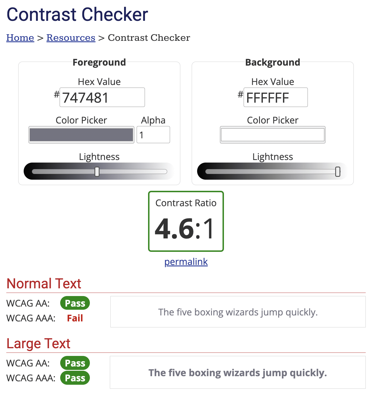
Start with contrast: your text should maintain a minimum contrast ratio of 4.5:1 against its background to ensure readability for users with visual impairments. (Black text on a white background has a contrast ratio of 21:1.) You can use tools like WebAIM to test the contrast ratio of your brand colors.

Font size matters too. Keep your body text at least 14px, and don’t be afraid to go larger for important information.
While it might be tempting to center text for visual impact, stick to left alignment for longer content—it helps readers track lines more easily, particularly those with dyslexia or cognitive impairments.
Pay attention to your line lengths and spacing as well. Aim to keep lines between 50-75 characters for optimal readability, and use generous spacing between lines and paragraphs to help readers parse information more effectively.
Remember that many people will be reading your transactional emails quickly, possibly on mobile devices or in less-than-ideal conditions, so clear visual hierarchy and comfortable reading spaces are essential.
5. Make Links and Buttons Accessible
Interactive elements in your transactional emails deserve special attention—they’re often the primary action you want users to take, whether that’s tracking a package or confirming an account.
Start by making your click and tap targets large enough; a minimum size of 44×44 pixels ensures users with motor difficulties can interact with them comfortably.
Leave plenty of space between these clickable elements to prevent accidental taps, especially on mobile devices.
When writing link text, avoid generic phrases like “click here” or “read more.” Instead, make your links descriptive and meaningful—”Track your package” or “View order details” tells users exactly what to expect. This is particularly important for screen reader users who may navigate through a list of links in your email.
Visual distinction is crucial too. While color can be used to highlight links and buttons, never rely on color alone—some users may not be able to distinguish them.
Make sure your buttons clearly look clickable through other visual cues like borders or background colors, and consider underlining your inline links.
6. Design for Different Devices
Your emails need to work seamlessly across all devices and viewing preferences. Make sure your layout adapts gracefully to mobile devices, where many of your customers will be reading their transactional emails.
Pay special attention to how your text behaves when scaled up. If customers need to zoom in to read important details, those details should remain clear and properly formatted.
Don’t forget to verify that all interactive elements work well with touch interfaces—what works with a precise mouse click needs to work just as well with a finger tap.
7. Write Clear, Actionable Copy
Clear writing is crucial for accessibility. Users with dyslexia or cognitive impairments need simple, straightforward content that’s easy to process.
Keep your language clear and concise, avoiding idioms, slang, or regional expressions that might confuse readers who speak English as a second language.
Technical jargon should only be used when absolutely necessary, and consider providing simple explanations when you do use it.
If you’re dealing with complex information, break it into smaller, digestible chunks. This helps readers with cognitive processing difficulties and makes your content more accessible to everyone.
Structure your content with clear headings and short paragraphs, making it easy for all users to scan and understand what they need to do next. Every transactional email should have an obvious purpose and, where needed, clear instructions for any required actions.
8. Test Thoroughly
Testing is an essential part of creating accessible email templates. Start by testing across multiple email clients, as accessibility features can render differently in each one. Then check how your emails work with popular screen readers—you might be surprised at how your carefully crafted message actually sounds.
Make sure keyboard navigation flows logically through your email, especially for any interactive elements.
Test your design in both light and dark modes, as many users rely on these settings for comfort and accessibility.
Finally, whenever possible, get feedback from users with different abilities. Real-world testing often reveals accessibility issues that technical checks might miss.
Email Accessibility Checklist
Here’s a comprehensive checklist to help you ensure your transactional emails are accessible to everyone:
Content Structure
- Use clear, descriptive subject lines
- Put the most important information at the start
- Use proper heading hierarchy (H1 → H2 → H3)
- Break content into digestible chunks
- Include both HTML and plain text versions
- Add language tags to your HTML (html lang=”en”)
Text and Readability
- Use sans-serif fonts
- Maintain minimum 14px font size for body text
- Ensure 1.5x line height
- Keep content at 7th-8th grade reading level
- Avoid idioms, slang, and complex technical terms
- Left-align text (avoid justified text)
- Use sufficient white space between paragraphs
Colors and Contrast
- Maintain 4.5:1 minimum contrast ratio for text
- Don’t rely on color alone to convey meaning
- Test design in both light and dark modes
- Ensure links are visually distinct
Images and Media
- Add descriptive alt text for important images
- Avoid using images for critical information
- Ensure any animations flash less than 3 times per second
- Style buttons with CSS rather than using images
Links and Interactive Elements
- Make clickable areas at least 44×44 pixels
- Use descriptive link text (no “click here”)
- Ensure adequate spacing between clickable elements
- Test all interactive elements with keyboard navigation
Technical Requirements
- Use semantic HTML
- Test across multiple email clients
- Ensure responsive design works at all zoom levels
- Verify proper reading order in code
- Test with screen readers
Testing
- Check with multiple accessibility tools
- Test at different zoom levels
- Verify mobile responsiveness
- Get feedback from users with different abilities
- Test with images disabled
- Verify keyboard navigation
- Check in different email clients
Save this checklist and use it every time you create or update your transactional email templates.
Remember, by making accessibility a core part of your email design process, you’re not just complying with legal requirements; you’re creating a better experience for all your users.
That’s it! Now you know how to make your transactional emails more accessible.
Next, would you like to learn how to make your emails more accessible to users all over the world? Check out our guide to how to write transactional emails for multi-language audiences for more information.
