First impressions matter. And your onboarding emails are often the first real interaction new users have with your brand after that initial sign-up.
A great onboarding sequence can be the difference between a customer who’s excited to dive in and one who abandons your product before they even really start.
But crafting those perfect onboarding emails? That’s easier said than done. You need to welcome, educate, and motivate all at the same time.
That’s why I’ve rounded up some of the best onboarding email examples out there to give you a dose of inspiration. From SaaS giants to e-commerce wizards, these brands have nailed the art of the onboarding email.
I’ll break down what makes them so effective, and give you actionable takeaways to apply to your own campaigns.
Get ready to transform your user onboarding and boost engagement from day one!
- What Makes a Good Onboarding Email?
- Best Onboarding Email Examples
- Vimeo: A Simple Welcome with a Powerful Visual Focus
- Bitly: Gamifying Onboarding with a Progress-Driven Approach
- Grammarly: A Feature-Rich Welcome for Polished Writing
- Spotify for Podcasters: A Streamlined Onboarding Experience for Podcast Creators
- Headway: A Playful Nudge Towards Knowledge
- Zoom: Your Fast Track to Seamless Communication
- Lulu: A Simplified Path to Publishing for Aspiring Authors
- Miro: A Visual Invitation to Collaborative Creativity
- Shutterstock: Your Creative Canvas Awaits
What Makes a Good Onboarding Email?
Onboarding emails aren’t just about saying “hello.” They’re your chance to make a lasting impression and guide users toward success with your product or service.
Effective onboarding emails translate to happier, more engaged users. They can:
- Reduce churn: By guiding users and demonstrating value early on, you’re more likely to keep them around for the long haul.
- Increase product adoption: Help users understand and utilize your product’s key features, leading to greater satisfaction and stickiness.
- Drive conversions: Nurture users towards desired actions, whether it’s making a purchase, upgrading their plan, or inviting team members.
Here’s what sets the best onboarding emails apart:
Deliverability First
Before you can wow them with your welcome, your email needs to land in their inbox (not the spam folder!).
Maintain a healthy sender reputation by using a reputable email service provider, keeping your email list clean, and following email best practices.
Be Simple and Clear
New users need clear, concise information. Avoid overwhelming them with jargon or too many actions at once. Each email should have a specific focus and guide users towards a single, achievable goal.
Value-Driven Messaging
Highlight the benefits of your product and how it solves the user’s pain points. Show them why they should care, not just what your product does.
Personalization
Whenever possible, use the user’s name and tailor content based on their interests or signup information. This makes the experience feel more relevant and engaging.
Strong Call to Action
Every onboarding email needs a clear and compelling CTA. Whether it’s encouraging users to complete their profile, explore a key feature, or make their first purchase, tell them exactly what you want them to do next.
Visual Appeal
Don’t neglect the design! Use visuals, white space, and a clear layout to make your emails easy to read and navigate.
Strategic Segmentation
Consider creating different onboarding sequences for different user segments. Their needs and goals might vary, so your emails should too.
Best Onboarding Email Examples
Ready to see these principles in action? Let’s take a closer look at some stellar onboarding email examples!
Vimeo: A Simple Welcome with a Powerful Visual Focus
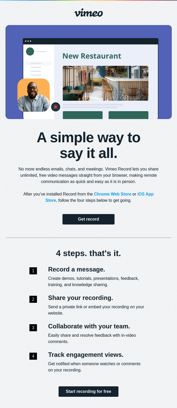
Vimeo kicks off its onboarding with an email that’s clean, visually driven, and gets straight to the point. Dominated by a screenshot of their product in action, the email immediately showcases the value proposition of Vimeo Record: simple, effective video messaging.
What Works:
- Visual Clarity: The hero image does the heavy lifting, instantly communicating the core functionality of the tool.
- Concise Copy: The text is minimal and focused, highlighting key benefits like ease of use and unlimited free recordings.
- Easy-to-Follow Steps: A numbered list clearly outlines the onboarding process, making it feel approachable and manageable.
- Single Call to Action: The “Start recording for free” CTA is prominent and directly aligned with the email’s goal: driving immediate product adoption.
Key Takeaway: Sometimes, a picture really is worth a thousand words. Vimeo’s onboarding email proves that strong visuals and concise copy can be a winning combination. By showcasing the product’s core value upfront, they encourage users to dive in and experience it firsthand.
Bitly: Gamifying Onboarding with a Progress-Driven Approach
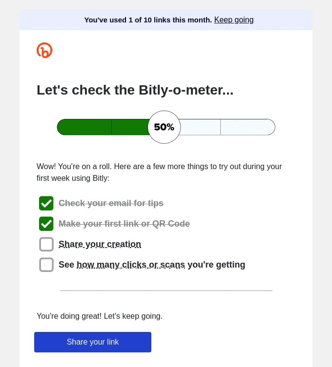
Bitly takes a unique approach to onboarding by incorporating gamification to encourage early engagement. This email uses a progress bar (the “Bitly-o-meter”) and a checklist to motivate users to explore key features and experience the platform’s value.
What Works:
- Progress Visualization: The progress bar provides a sense of accomplishment and encourages users to complete the remaining steps.
- Actionable Checklist: Clear, concise tasks guide users towards specific actions, making the onboarding process feel structured and achievable.
- Positive Reinforcement: Phrases like “Wow! You’re on a roll!” and “You’re doing great!” provide encouragement and create a sense of momentum.
- Focused CTA: The “Share your link” CTA aligns with the core functionality of the platform and encourages users to experience the primary benefit of Bitly.
Key Takeaway: Gamification can be a powerful tool for driving user engagement during onboarding. By visualizing progress and providing a clear path to success, Bitly motivates users to take action and experience the value of their platform.
Grammarly: A Feature-Rich Welcome for Polished Writing
Grammarly’s onboarding email dives straight into the value proposition of their premium service. It highlights key features and benefits, emphasizing how Grammarly can help users achieve their writing goals.

What Works:
- Benefit-Driven: The email immediately focuses on the benefits of Grammarly Premium, showcasing features that enhance writing quality and professionalism.
- Feature Highlighting: Icons and concise descriptions effectively communicate the value of each feature, making it easy for users to understand the advantages of upgrading.
- Cross-Platform Accessibility: The email emphasizes Grammarly’s availability across various devices and platforms, ensuring users can seamlessly integrate the tool into their workflow.
- Direct CTAs: Clear “INSTALL” buttons encourage users to take immediate action and install the necessary Grammarly components for their preferred platforms.
Key Takeaway: Grammarly’s onboarding email effectively showcases the breadth and depth of its premium features, enticing users to upgrade by demonstrating how these features can elevate their writing. By providing clear installation instructions, it encourages users to fully utilize the tool and maximize their writing potential.
Spotify for Podcasters: A Streamlined Onboarding Experience for Podcast Creators
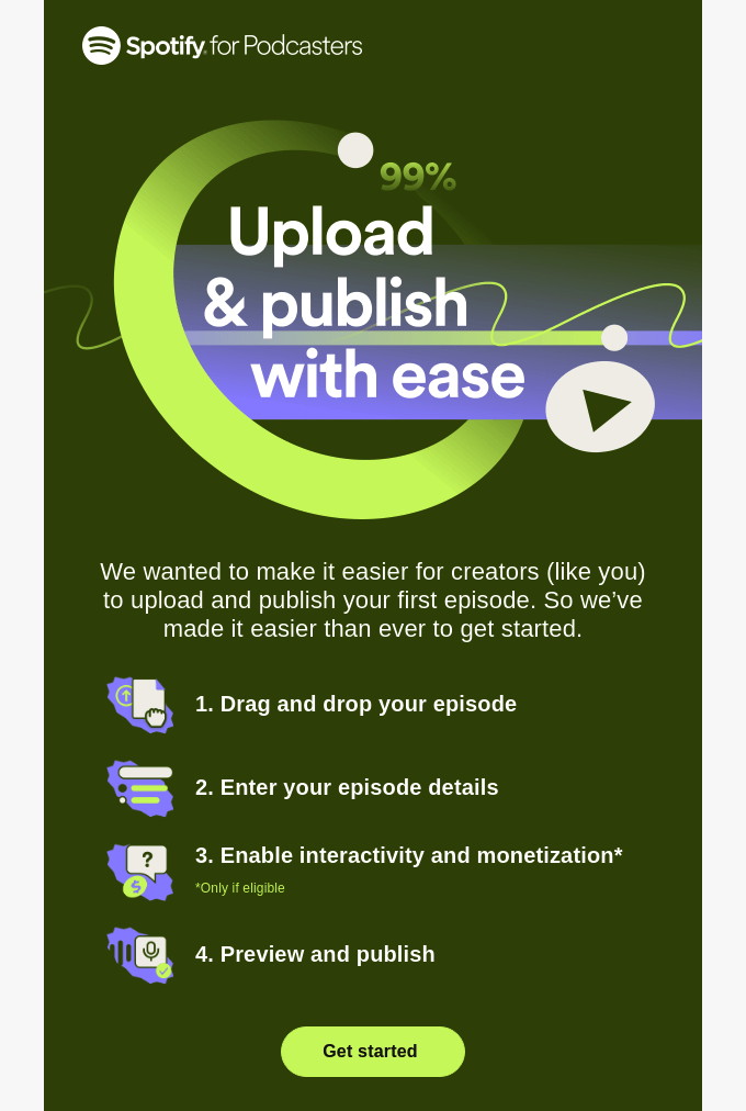
Spotify for Podcasters aims for a frictionless onboarding experience with this email. It focuses on ease of use and guides new podcasters through the essential steps to publish their first episode.
What Works:
- Immediate Impact: The email immediately highlights the ease of uploading and publishing, addressing a key concern for new podcasters.
- Simplified Process: A numbered list breaks down the process into four simple steps, making it feel manageable and encouraging immediate action.
- On-Brand Design: The design is clean and uses Spotify’s signature green, creating a visually appealing and on-brand experience.
- Clear Next Steps: The “Get started” button encourages users to begin the process without delay, leading them directly to the platform.
Key Takeaway: Spotify for Podcasters’ onboarding email excels at removing barriers to entry. By simplifying the publishing process and emphasizing ease of use, it empowers new podcasters to take action and share their voices with the world.
Headway: A Playful Nudge Towards Knowledge
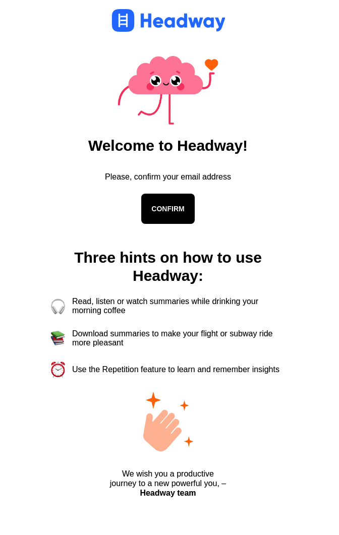
Headway’s onboarding email sets a friendly and encouraging tone from the get-go. With its cheerful brain mascot and simple design, it aims to make users feel welcome and excited to start their learning journey.
What Works:
- Personality-Driven Visuals: The cartoon brain adds a touch of personality and reinforces the app’s focus on learning and self-improvement.
- Concise and Actionable: The email gets straight to the point, prompting users to confirm their email address with a clear “CONFIRM” button.
- Helpful Hints: Three concise tips provide immediate value and demonstrate how Headway can be integrated into daily life.
- Motivational Tone: The closing message encourages users to embark on a “productive journey” and achieve their goals.
Key Takeaway: Headway’s onboarding email isn’t just a confirmation request; it’s a delightful invitation to a world of bite-sized learning. It cleverly uses playful visuals and encouraging language to spark curiosity and position Headway not as a chore, but as a fun and accessible path to self-improvement.
Zoom: Your Fast Track to Seamless Communication
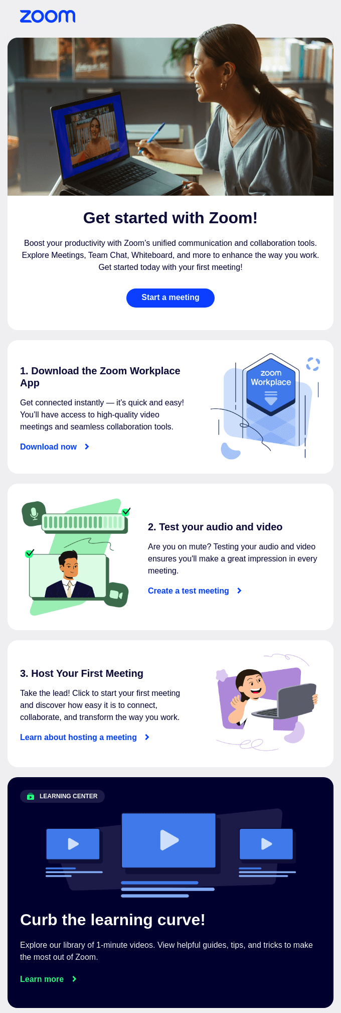
Zoom’s onboarding email focuses on quickly getting users up and running with their platform. It provides a clear and concise walkthrough of the essential steps to start using Zoom’s core features.
What Works:
- Action-Oriented: The email emphasizes immediate action, encouraging users to start a meeting right away.
- Guided Experience: A numbered list with visual aids guides users through downloading the app, testing their equipment, and hosting their first meeting.
- Problem-Solving Focus: The email highlights Zoom’s unified communication and collaboration tools, showcasing the platform’s versatility.
- Multiple Calls to Action: Strategically placed CTAs encourage users to download the app, test their setup, learn more about hosting, and explore the learning center.
- Resourceful Learning Center: The email promotes Zoom’s learning center, providing users with additional resources and support to maximize their experience.
Key Takeaway: Zoom’s onboarding email is like a personal invitation to a communication command center. It guides you through the essentials with remarkable efficiency, leaving you feeling not just welcomed, but confident and ready to explore all the ways Zoom can enhance your interactions.
Lulu: A Simplified Path to Publishing for Aspiring Authors
Lulu’s onboarding email focuses on making self-publishing accessible and approachable. It guides new users through the essential steps to bring their book to life, emphasizing the ease and simplicity of the process.

What Works:
- Immediate Impact: The email immediately highlights the ease of creating and publishing a book with Lulu, addressing a potential barrier for aspiring authors.
- Structured Onboarding: A numbered list breaks down the publishing journey into three straightforward steps, making it feel manageable and encouraging immediate action.
- Visual Guidance: The email incorporates a short video tutorial to further simplify the process and provide a visual walkthrough for new users.
- Helpful Resources: The email promotes additional resources like a beginner’s guide to book-making, offering further support and guidance for aspiring authors.
- Action-Oriented: The “Start My Project” button encourages users to begin the publishing process without delay, leading them directly to the platform.
Key Takeaway: Lulu’s onboarding email doesn’t just simplify self-publishing; it makes it feel achievable. By breaking down the process into digestible steps and offering supportive resources, it instills confidence in aspiring authors and encourages them to take that first exciting step.
Miro: A Visual Invitation to Collaborative Creativity
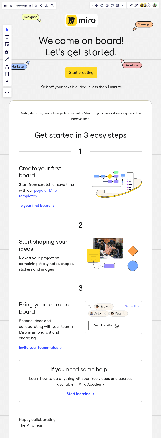
Miro’s onboarding email is a visual treat that perfectly reflects the platform’s core function: a collaborative online whiteboard. It uses screenshots and a clear step-by-step guide to quickly introduce new users to the key features and benefits.
What Works:
- Immersive Visuals: The email mirrors the Miro interface, immediately immersing users in the visual workspace experience. Screenshots showcase the platform’s capabilities and make it easy to understand its core functionality.
- Concise and Actionable: The copy is minimal and focused, guiding users through three essential steps to get started. Each step includes a clear CTA button that encourages immediate action.
- Emphasis on Collaboration: The email highlights the collaborative aspects of Miro, encouraging users to invite their team and experience the benefits of shared workspaces.
- Helpful Resources: The email promotes Miro Academy, offering free videos and courses for users who want to delve deeper into the platform’s features.
Key Takeaway: Miro’s onboarding email is a masterclass in showing, not just telling. By mirroring the platform’s visual style and providing a clear path to get started, it invites users to experience the magic of collaborative creativity firsthand.
Shutterstock: Your Creative Canvas Awaits
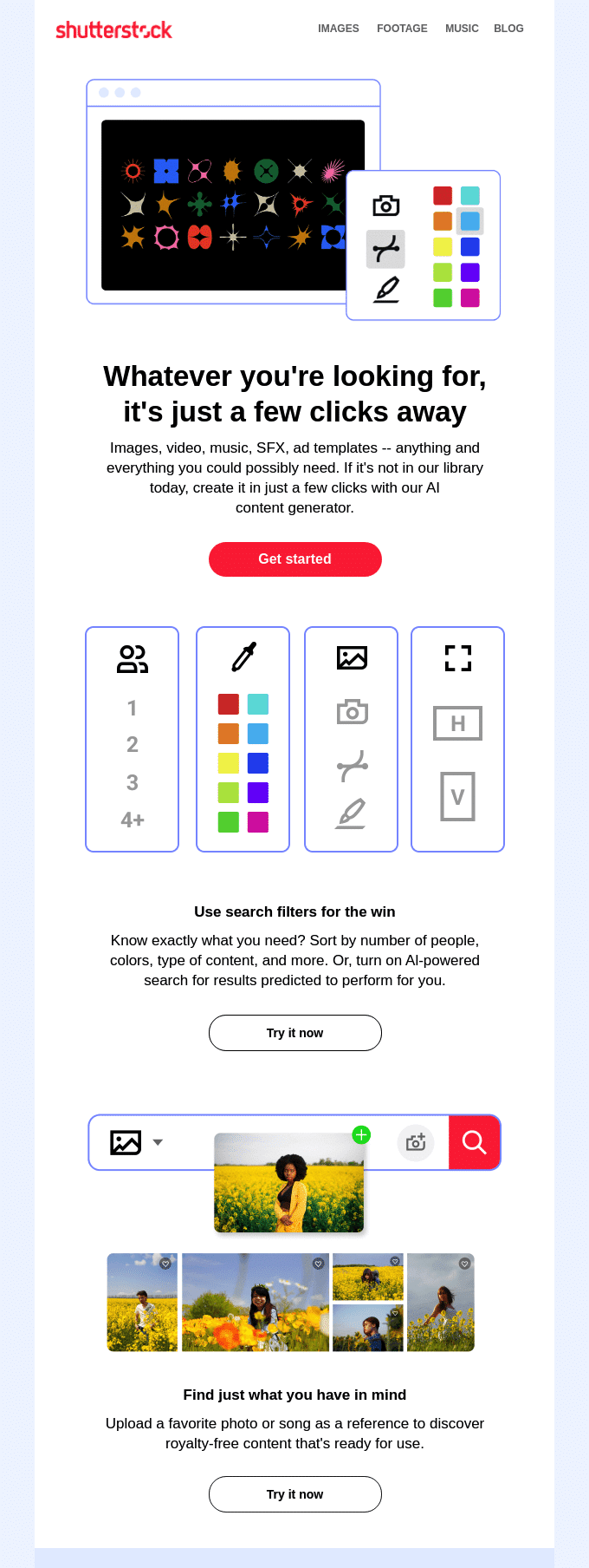
Shutterstock’s onboarding email is a visual invitation to explore a world of creative possibilities. With a clean design and compelling imagery, it instantly showcases the platform’s vast library of high-quality assets.
What Works:
- Visual Impact: The email uses striking visuals to showcase the diversity and quality of Shutterstock’s images, videos, and music.
- Effortless Exploration: It highlights the platform’s user-friendly search functionalities, making it easy to find the perfect asset.
- Clear and Concise: The copy is minimal and focused, emphasizing the key benefits of using Shutterstock.
- Multiple Entry Points: It offers various ways to begin exploring the content, including general search, filtered search, and visual search.
- Direct Call to Action: A prominent “Get Started” button encourages immediate engagement with the platform.
Key Takeaway: Shutterstock’s onboarding email doesn’t just tell you about their content; it immerses you in it. This first impression effectively communicates the sheer scale and quality of Shutterstock’s library, leaving you eager to explore and discover the perfect creative assets for your needs.
That’s it! Now you know have some great onboarding email examples.
Next, would you like to learn about the difference between different sending methods? Check out our tutorial on SMTP vs API for more information.
