Are you looking for welcome email examples?
Welcome emails are often your first opportunity to communicate with new customers and they’re essential for setting expectations, strengthening your brand, and making the reader more receptive to more emails in the future.
When you’re designing your welcome emails it can help to take inspiration from other brands.
I’ve scoured my inbox for some of the best welcome emails I could find to help give you some fresh ideas for design, layout, and content. Whether you’re looking to improve user onboarding, boost engagement, or simply make a stellar first impression, these examples will inspire your next welcome email campaign
- What Makes a Good Welcome Email?
- Best Welcome Email Examples
- 1. AppSumo – The Engaging Offer
- 2. Slack – The Workspace Welcome
- 3. Coursera – The Inspirational Educator
- 4. Dropbox – The Feature Showcase
- 5. IWOOT – The Visual Product Showcase
- 6. Codecademy – The Instant Learning Kickstart
- 7. Chip – The App Download Driver
- 8. Google Workspace – The Comprehensive Onboarding Guide
- 9. Monday.com – The Visual Efficiency Booster
- 10. Public Lands – The Outdoor Enthusiast’s Welcome
- 11. Starling – The Feature-Rich Onboarder
- 12. Lush – The Ethical Beauty Introducer
- 13. Threadless – The Artist Community Welcomer
- 14. Todoist- The Productivity Kickstarter
- 15. Firebox – The Quirky Personality Showcase
- 16. Asana – The Productivity Jumpstarter
What Makes a Good Welcome Email?
Your welcome email is often the first touchpoint in your transactional email sequence, setting the tone for your entire customer relationship.
To get the most out of these messages, it’s crucial to understand what makes a welcome email not just good, but highly effective for your business.
High Deliverability
First things first: your welcome email needs to land in the inbox, not the spam folder. Ensure your email authentication (SPF, DKIM, DMARC) is properly set up, use a reputable email service provider like SendLayer that specializes in transactional emails, and follow email deliverability best practices.
Remember, even the best-crafted email is useless if it’s not delivered.
Clear, Engaging Subject Line
Your subject line is crucial for open rates. Keep it concise and relevant. For example: “Welcome to [Your Service] – Next Steps” or “Your [Your Product] Account is Ready!” Avoid spam trigger words and excessive punctuation to maintain deliverability.
Personalization and Relevance
Make use of the data you’ve collected during sign-up. Address the user by name and tailor the content based on how they interacted with your site or app.
If they signed up after exploring a specific feature, mention it. This level of personalization shows attention to detail and can significantly boost engagement.
Clear and Concise Content
Your readers or customers are probably busy people and will appreciate you getting to the point quickly.
Save long-form content for your marketing emails and keep your welcome emails brief. You should simply confirm their account creation or subscription, highlight key features or immediate next steps, and provide quick links to essential resources or documentation.
Clear Call-to-Action (CTA)
Guide your new user on what to do next. Whether it’s “Complete Your Profile,” “Explore the Dashboard,” or “Start Your First Project,” make sure your CTA is prominent and action-oriented. A single, focused CTA often performs better than multiple options.
Setting Expectations
Be transparent about what users can expect from your service and future communications.
Will you be sending product updates? Usage tips? How often? Setting these expectations upfront can improve long-term engagement and reduce unsubscribe rates.
Your welcome email sets the stage for user activation, engagement, and ultimately, customer retention. Remember, you’re not just saying “hello,” you’re laying the foundation for a strong, lasting customer relationship.
Pro Tip: If you’re building a custom web application, consider creating a reusable welcome email with your branding. Our tutorial covers how to design reusable email templates in React.
If you’re using a frontend framework like React
Best Welcome Email Examples
Let’s take a look at some outstanding welcome email examples and break down why they work so well. Each of these can offer valuable insights for anyone looking to optimize their transactional emails.
1. AppSumo – The Engaging Offer
Subject line: You’re in! 🎉

Why it works:
- Eye-catching design with a vibrant green background and playful illustrations
- Immediate value proposition with a prominent “10% off” offer
- Friendly, conversational tone that builds rapport (“You look so smart right now.”)
- Clear explanation of the company’s unique selling proposition (USP)
- Multiple calls-to-action (CTAs) for different user interests
- Showcases product categories to encourage exploration
- Highlights key benefits: money-back guarantee, lifetime deals, 95% off most products
Key takeaways:
- Offer immediate value: The 10% discount encourages quick action and shows appreciation for new subscribers.
- Inject personality: The casual, slightly humorous tone makes the brand more relatable and memorable.
- Explain your USP: AppSumo clearly states what sets them apart (“The hottest software at bonkers prices”).
- Provide multiple engagement options: The email offers various ways to interact with the brand, from browsing collections to taking advantage of the discount.
- Highlight key benefits: The icons at the bottom quickly communicate important selling points.
This example is particularly relevant for e-commerce platforms, SaaS companies, and marketplaces catering to small businesses and entrepreneurs. It demonstrates how to create an engaging, value-packed welcome email that not only introduces the brand but also motivates immediate action.
2. Slack – The Workspace Welcome
Subject line: New Workspace on Slack: new account details
Why it works:
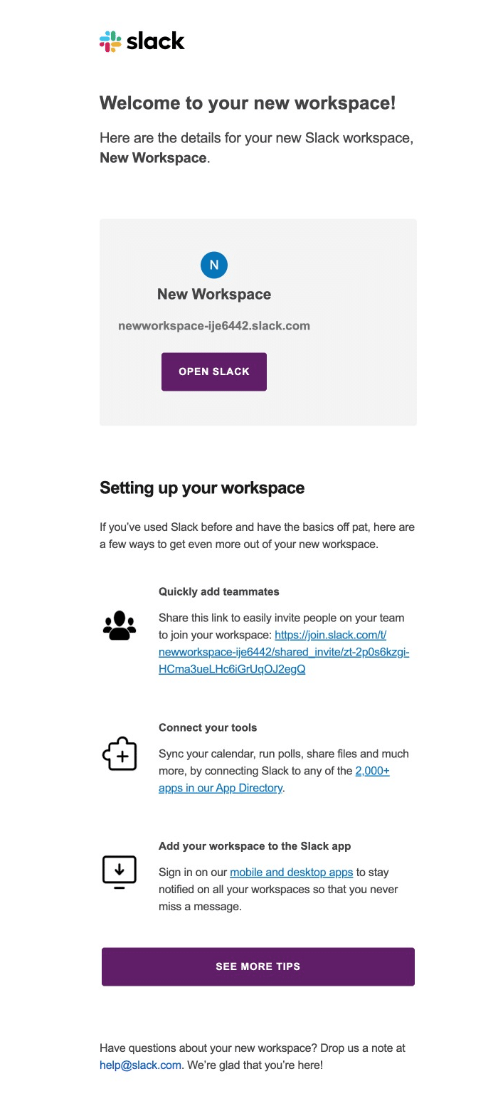
- Clean, minimalist design aligns with Slack’s brand identity
- Provides essential information about the new workspace upfront
- Offers next steps for setting up the workspace, catering to both new and experienced users
- Includes specific, actionable tips like adding teammates and connecting tools
- Provides a secondary CTA for more advanced tips
- Closes with customer support information, showing commitment to user success
Key takeaway: Focus on immediate utility and clear next steps. This approach is particularly effective for SaaS products and collaboration tools, guiding users towards key actions that drive engagement and adoption.
This welcome email effectively balances providing necessary information with encouraging immediate action, making it an excellent model for apps and services that require user setup and team collaboration.
3. Coursera – The Inspirational Educator
Subject line: Get started with these free courses
Why it works:
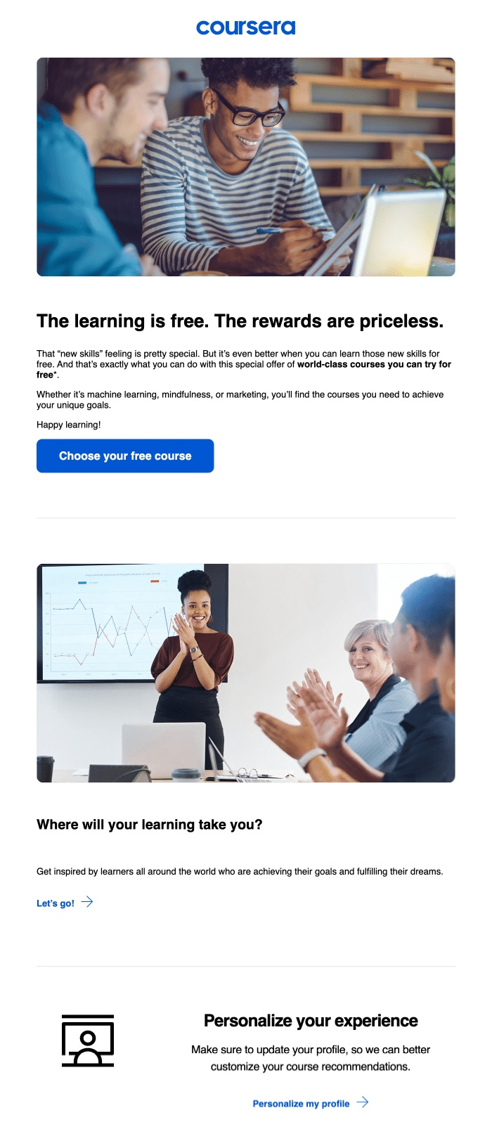
- Strong, motivational headline: “The learning is free. The rewards are priceless.”
- High-quality images showing diverse learners collaborating and succeeding
- Clear value proposition emphasizing free access to world-class courses
- Specific course examples (machine learning, mindfulness, marketing) showcase range
- Inspirational question “Where will your learning take you?” prompts user reflection
- Strong, action-oriented CTA: “Choose your free course”
- Encourages profile customization for personalized recommendations
- References global learning community, fostering sense of belonging
- Friendly, encouraging tone throughout (“Happy learning!”)
Key takeaways:
- Emphasize value: Highlight the benefits users gain from your service, especially if offering something for free.
- Use aspirational imagery: Visuals of success can motivate users to engage with your product.
- Provide clear next steps: Give users a direct, easy action to take immediately.
- Personalization: Encourage users to customize their experience for better engagement.
- Inspire vision: Prompt users to imagine their future success with your product.
This welcome email effectively balances inspiration, clear value, and actionable steps. It’s particularly effective for educational platforms or services offering personal/professional development, but the strategies can be adapted for various industries focused on user growth and engagement.
4. Dropbox – The Feature Showcase
Subject line: Your Dropbox Business Plus trial starts now
Why it works:
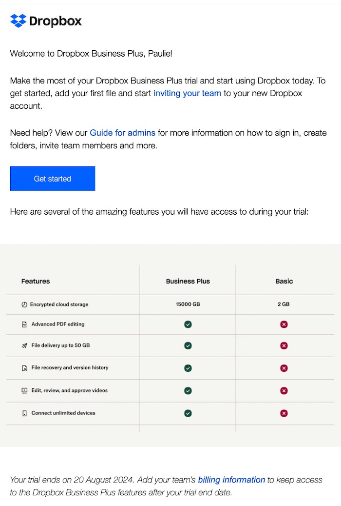
- Personal greeting using the recipient’s name (“Welcome to Dropbox Business Plus, Paulie!”)
- Clear, concise instructions on how to get started
- Provides immediate action steps: add a file and invite team members
- Offers additional resources with a link to the “Guide for admins”
- Comparative feature table showcasing Business Plus advantages over Basic plan
- Specific trial end date with clear next steps for continued access
- Clean, minimalist design reflecting Dropbox’s brand identity
Key takeaways:
- Clarity is key: Provide clear, actionable steps for new users to get started immediately.
- Offer resources: Link to additional guides or help documents for users who need more information.
- Set expectations: Clearly state trial duration and what happens afterward.
- Personalization: Use the recipient’s name to create a more engaging, personal feel.
This email demonstrates how to create a straightforward, informative welcome that clearly communicates product value and encourages immediate engagement.
5. IWOOT – The Visual Product Showcase
Subject line: Hello, there! Welcome to iWoot 👋
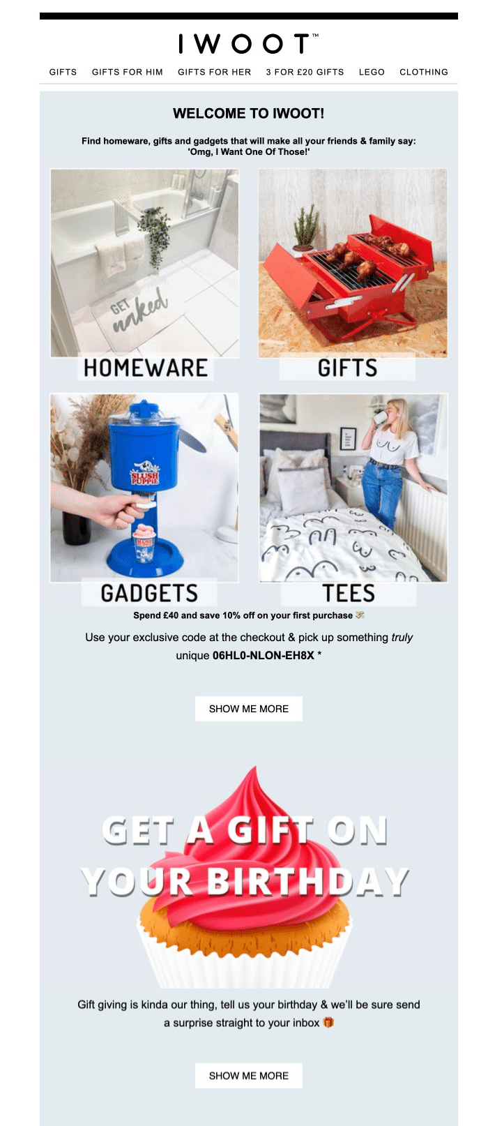
Why it works:
- Enthusiastic welcome message: “WELCOME TO IWOOT!”
- Clever tagline that encapsulates the brand’s unique selling proposition: “Omg, I Want One Of Those!”
- Visual showcase of product categories with high-quality, appealing images
- Immediate offer: “Spend £40 and save 10% off on your first purchase”
- Exclusive discount code provided, creating a sense of personalization
- Secondary promotion for birthday gifts, encouraging future engagement
- Multiple “SHOW ME MORE” CTAs, prompting exploration of the site
- Clean, visually appealing design that aligns with the brand’s fun, quirky image
Key takeaways:
- Visual appeal: Use high-quality images to showcase product variety and appeal.
- Immediate incentive: Offer a discount on the first purchase to encourage immediate action.
- Future engagement: Plant seeds for ongoing interaction (e.g., birthday gift promotion).
- Clear categorization: Help users quickly understand your product range.
- Multiple CTAs: Provide several opportunities for users to engage with your site.
This welcome email is particularly effective for e-commerce businesses, especially those focusing on unique or gift items. It balances introducing the brand’s personality with showcasing products and offering immediate value.
6. Codecademy – The Instant Learning Kickstart
Subject line: It’s nice to meet you
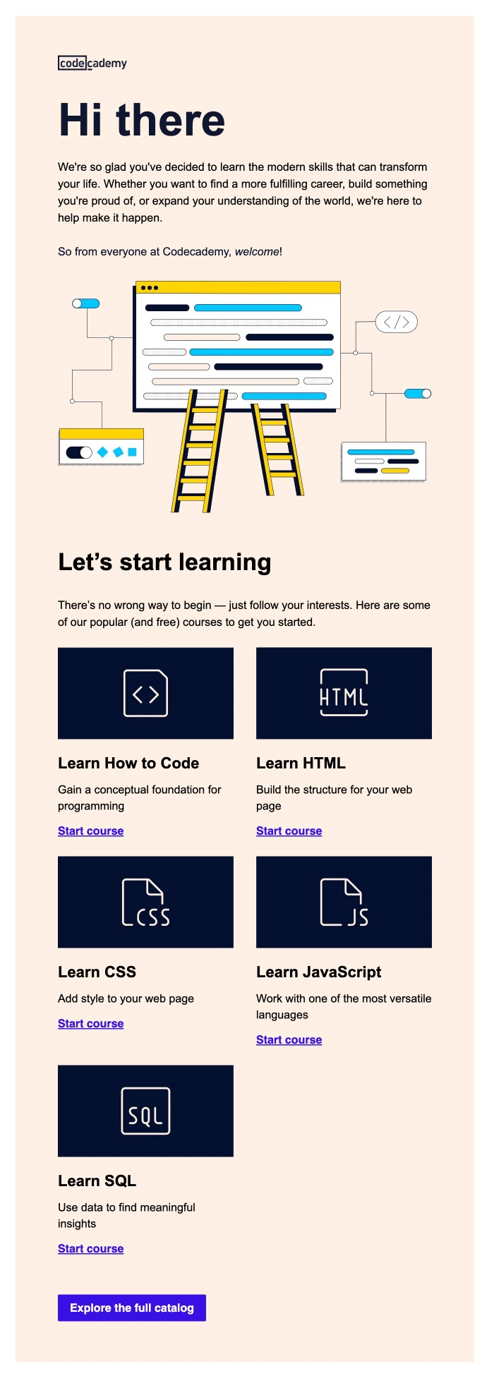
Why it works:
- Friendly, casual greeting: “Hi there”
- Inspirational opening paragraph that ties learning to personal growth and career advancement
- Welcoming message from the entire Codecademy team, creating a sense of community
- Eye-catching illustration representing coding concepts in a simple, approachable way
- Clear call-to-action: “Let’s start learning”
- Emphasis on user choice and interests: “There’s no wrong way to begin — just follow your interests.”
- Showcases popular (and free) courses to get started immediately
- Each course option includes a brief description and a “Start course” CTA
- Provides a mix of foundational (Learn How to Code) and specific language courses (HTML, CSS, JavaScript, SQL)
- Final CTA to “Explore the full catalog” for users who want more options
Key takeaways:
- Inspirational tone: Connect learning to personal and professional growth to motivate users.
- Immediate action: Provide clear, actionable steps for users to begin learning right away.
- Visual appeal: Use illustrations to make coding concepts feel approachable and fun.
- Choice and flexibility: Offer various starting points to cater to different interests and skill levels.
- Free value upfront: Highlight free courses to reduce barriers to entry.
This welcome email is particularly effective for online learning platforms, especially those focused on technical skills. It demonstrates how to create an engaging welcome that immediately involves the user in the learning process while setting expectations for their journey ahead.
7. Chip – The App Download Driver
Subject line: Welcome to Chip

Why it works:
- Clear, prominent headline: “Welcome to Chip”
- Immediate value proposition: “Your wealth app is waiting for you…”
- Personal touch with a message from Tom, VP of Marketing, including his photo
- Addresses various user goals: saving for rainy day, looking for better rate, house deposit, long-term wealth
- Emphasizes ease of use: “It should only take a minute to download and install the app.”
- Highlights community aspect: “Join our community of wealth builders”
- Promises future tips and guidance
- Uses lifestyle images to appeal to target demographic
Key takeaways:
- Focus on action: Consistently encourage the primary action (app download) throughout the email
- Personal touch: Include a message from a team member to create a connection
- Address user goals: Mention various reasons why someone might use the app to appeal to different motivations
- Provide clear instructions: Offer step-by-step guidance for getting started
- Community building: Emphasize the community aspect and ongoing support
For businesses in the mobile app space, particularly fintech, this email demonstrates how to create a welcome that drives immediate action (app download) while setting expectations for the user journey ahead. It balances creating excitement about the app with practical steps for getting started.
8. Google Workspace – The Comprehensive Onboarding Guide
Subject line: Welcome to Google Workspace: See what you can do.
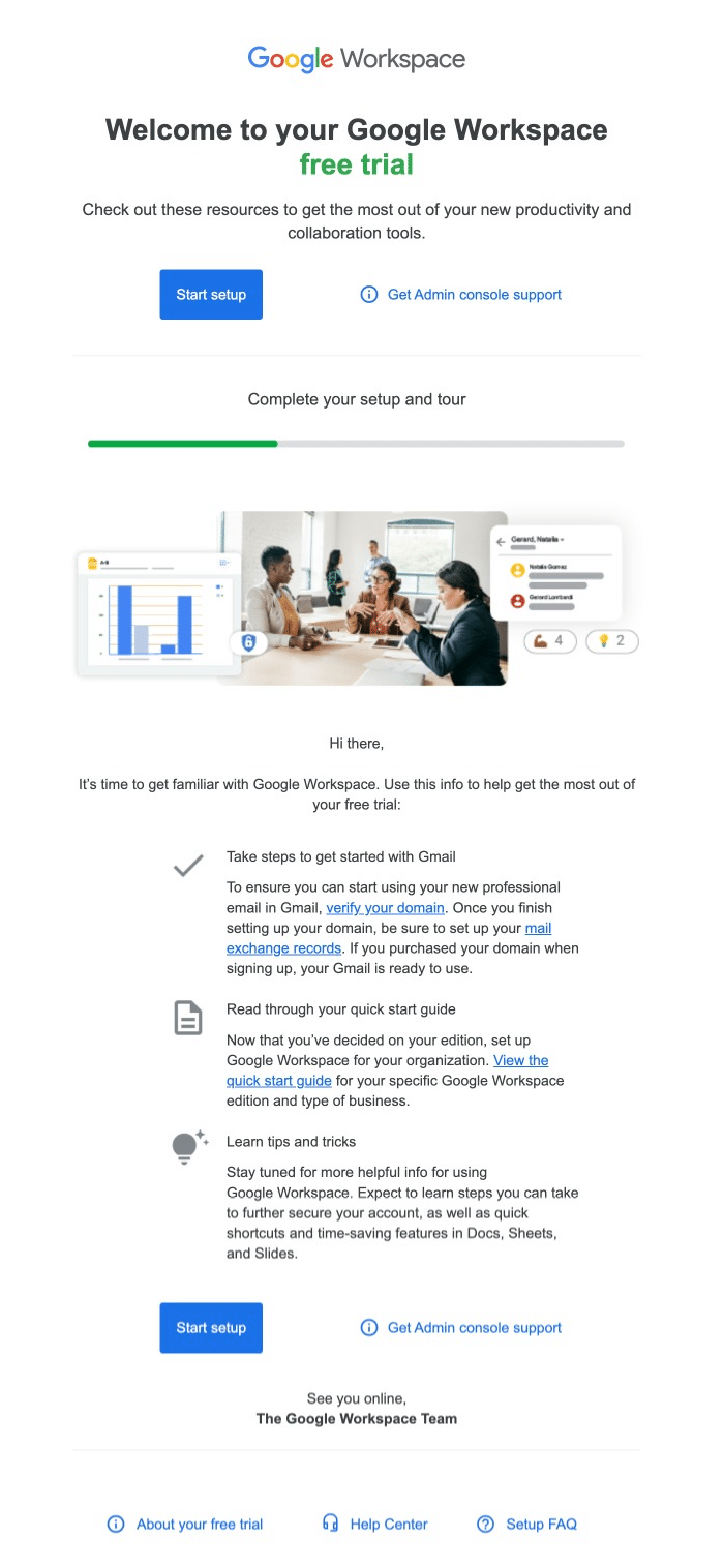
Why it works:
- Clear headline welcoming users to their Google Workspace free trial
- Emphasizes “free trial” to highlight the no-risk opportunity
- Provides immediate access to resources for maximizing productivity
- Two prominent CTAs: “Start setup” and “Get Admin console support”
- Visual progress bar to show setup completion status
- Step-by-step guide for getting started, focusing on key actions
- Repeats the main CTAs at the bottom for easy access
- Friendly sign-off: “See you online, The Google Workspace Team”
Key takeaways:
- Clear onboarding path: Provide a structured guide for getting started with complex tools
- Emphasize support: Highlight multiple ways users can get help
- Visual aids: Use images and progress bars to make the setup process feel manageable
- Focus on key actions: Prioritize the most important steps for new users
- Promise ongoing value: Tease future tips to encourage continued engagement
This welcome email is a great example of an effective onboarding email for SaaS products, especially comprehensive tool suites or platforms that require some setup. It balances providing necessary information with encouraging immediate action.
9. Monday.com – The Visual Efficiency Booster
Subject line: Welcome to monday.com 🎉
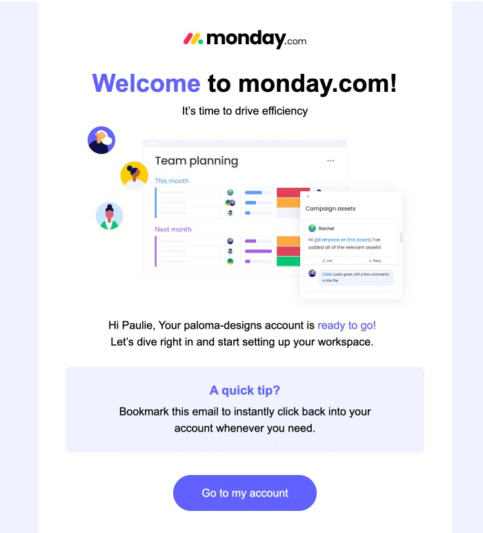
Why it works:
- Colorful, eye-catching headline: “Welcome to monday.com!”
- Clear value proposition: “It’s time to drive efficiency”
- Visual showcase of the product interface, highlighting team planning features
- Personalized greeting: “Hi Paulie, Your paloma-designs account is ready to go!”
- Encourages immediate action: “Let’s dive right in and start setting up your workspace.”
- Provides a useful tip: “Bookmark this email to instantly click back into your account whenever you need.”
- Clean, uncluttered design that reflects the product’s focus on organization and efficiency
Key takeaways:
- Visual product preview: Show the product in action to give users an immediate sense of its capabilities
- Personalization: Use the user’s name and account details to create a connection
- Actionable tip: Provide an immediate, useful suggestion to enhance user experience
- Clear next step: Offer a single, prominent call-to-action to guide users
- Brand consistency: Maintain a design aesthetic that aligns with the product’s core values (efficiency, organization)
If you want to create an email that gives users a taste of the product while providing a clear path to get started, this is a great example. It’s especially relevant for visually-oriented products or those that benefit from showing their interface upfront.
10. Public Lands – The Outdoor Enthusiast’s Welcome
Subject line: Welcome to Public Lands ⛰️ Let the adventures begin!

Why it works:
- Eye-catching header image that immediately conveys a sense of adventure
- Bold, enthusiastic “WELCOME!” greeting
- Clear value proposition: “Public Lands is your hub for the outdoors.”
- Promise of exclusive content: “You’ll be the first to hear about the latest trends and gear…”
- Showcases key services with visuals and brief descriptions
- Introduces the HUB community with member benefits
- Commitment to donating 1% of sales highlighted at the bottom
Key takeaways:
- Visual storytelling: Use high-quality images that resonate with your target audience
- Clear service breakdown: Highlight key offerings with brief, compelling descriptions
- Multiple engagement options: Provide various ways for users to interact with your brand
- Community focus: Emphasize belonging to a like-minded group
- Brand values: Showcase commitments to causes that matter to your audience
This email is a great example for lifestyle brands, especially those focused on outdoor activities and equipment. It balances introducing the brand’s offerings with encouraging immediate engagement and community participation.
11. Starling – The Feature-Rich Onboarder
Subject line: Welcome to Starling Bank, Paulie

Why it works:
- Engaging header with fireworks imagery, suggesting celebration and new beginnings
- Personalized greeting: “Paulie, you’re moments away from the future of banking”
- Clear next steps for account setup, including ID verification and card activation
- Visual representation of the bank card and app interface
- Breakdown of key features with icons and brief explanations
- Screenshots of the app showing various features in action
- Multiple CTAs throughout, guiding users to take specific actions
Key takeaways:
- Step-by-step onboarding: Guide users through the initial setup process clearly
- Feature showcase: Highlight key features with visual aids and brief explanations
- App preview: Show actual screenshots to familiarize users with the interface
- Multiple engagement points: Offer various calls-to-action for different user needs
- Emphasize support: Make it clear that help is readily available
This welcome email is particularly effective for fintech and digital banking services. It balances providing necessary setup information with showcasing the app’s features and benefits.
12. Lush – The Ethical Beauty Introducer
Subject line: Welcome to the Cosmetics Revolution 🫧

Why it works:
- Bold color scheme reinforces the playful feel of the Lush brand
- Clear brand positioning: “Welcome to the Cosmetics Revolution”
- Emphasizes their mission beyond selling products: “Help us leave the world lusher than we found it”
- Includes a video showcasing the brand
- Two clear CTAs for immediate engagement
- Highlights product categories with appealing imagery
Key takeaways:
- Visual brand story: Use high-quality images that reflect your products and values
- Clear mission statement: Communicate your brand’s purpose beyond just selling products
- Multiple engagement options: Provide various ways for users to interact with your brand
- Showcase product variety: Highlight different product categories to appeal to various interests
- Emphasize ethical stance: Make your brand values clear and prominent
This email demonstrates how to create a creative and unique welcome message that gives users a comprehensive view of your brand while providing multiple paths for engagement.
13. Threadless – The Artist Community Welcomer
Subject line: Welcome! You’ve locked $10 Tees.
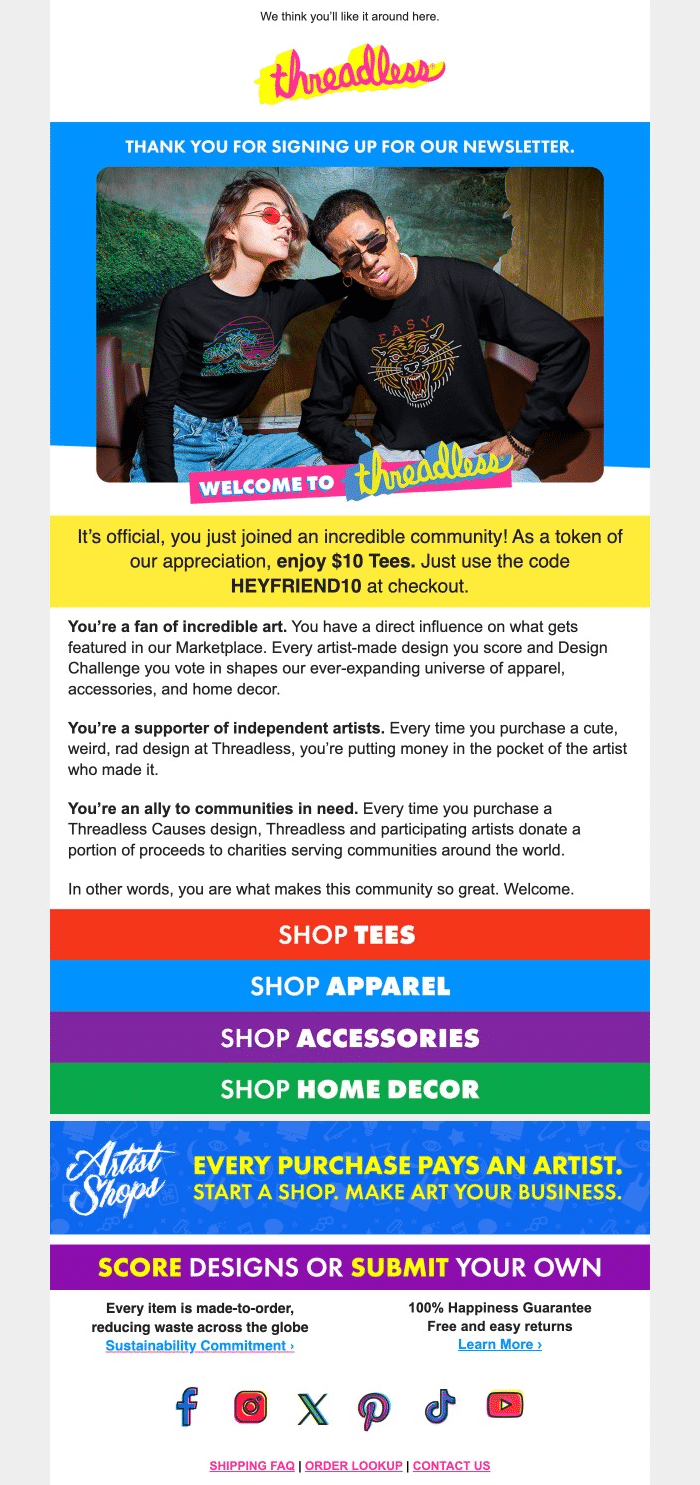
Why it works:
- Vibrant, eye-catching header with the Threadless logo
- Showcases product with a lifestyle image of people wearing Threadless designs
- Immediate value offer: “$10 Tees” discount
- Emphasizes community aspect: “you just joined an incredible community!”
- Clearly outlines three key aspects of being a Threadless customer
- Multiple, colorful CTAs for different product categories
- Highlights the opportunity for artists to open their own shops
- Emphasizes sustainability and customer satisfaction guarantees
Key takeaways:
- Community focus: Emphasize how users are joining a community, not just a mailing list
- Immediate incentive: Offer a discount or special deal to encourage first purchase
- Value proposition: Clearly state how your brand is unique (artist support, charity, sustainability)
- Visual showcase: Use high-quality images that represent your products and brand ethos
- Multiple engagement options: Provide various ways for users to interact with your brand (shop, score designs, submit designs)
This welcome email is relevant for brands that want to convey a sense of community, creativity, and social responsibility. It balances introducing the brand’s ethos with encouraging immediate engagement and purchase.
14. Todoist- The Productivity Kickstarter
Subject line: What do you need to do today?
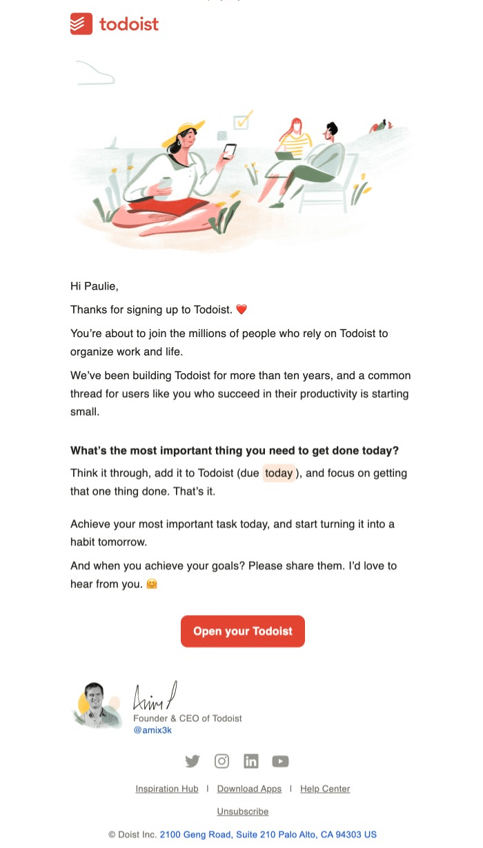
Why it works:
- Friendly, personalized greeting: “Hi Paulie,”
- Establishes credibility: “You’re about to join the millions of people who rely on Todoist”
- Provides an immediate, actionable task: “What’s the most important thing you need to get done today?”
- Offers a simple strategy for getting started: “Think it through, add it to Todoist (due today), and focus on getting that one thing done.”
- Personal touch with founder’s signature and photo
Key takeaways:
- Personal touch: Use a friendly tone and include a message from the founder
- Immediate action: Provide a simple, actionable task to get users started right away
- Core concept introduction: Explain the main idea behind your product succinctly
- Encourage habits: Show how your product can become part of the user’s daily routine
This email demonstrates how to create a welcome that not only introduces your product but also gets users to take action immediately.
15. Firebox – The Quirky Personality Showcase
Subject line: You’ve got a message from the big boss 👑

Why it works:
- Eye-catching header: “YOU’VE GOT A MESSAGE FROM THE BIG BOSS”
- Personal introduction from the Managing Director
- Humorous, self-deprecating tone: “You won’t hear loads from me because I’m super busy and important…”
- Clear value proposition: exclusive offers and “coolest new stuff” for subscribers
- Immediate reward with a discount code
- Showcases product categories with appealing imagery
- Highlights key benefits: 100-day returns, gift wrapping, free shipping over £50
Key takeaways:
- Inject personality: Use humor and a unique voice to make your brand memorable
- Offer immediate value: Provide a discount or exclusive offer right away
- Personal touch: Introduce a key figure from the company to create connection
- Set expectations: Clearly state what subscribers will receive and how often
- Showcase products: Give a taste of what you offer with visually appealing examples
This welcome email is a great example of how to use humor and a strong brand personality with clear information about subscriber benefits, products, and key selling points. If you want to establish a unique, quirky persona and build a relationship with your customers beyond just transactions, this is a great one to provide inspiraton.
16. Asana – The Productivity Jumpstarter
Subject line: You did it!
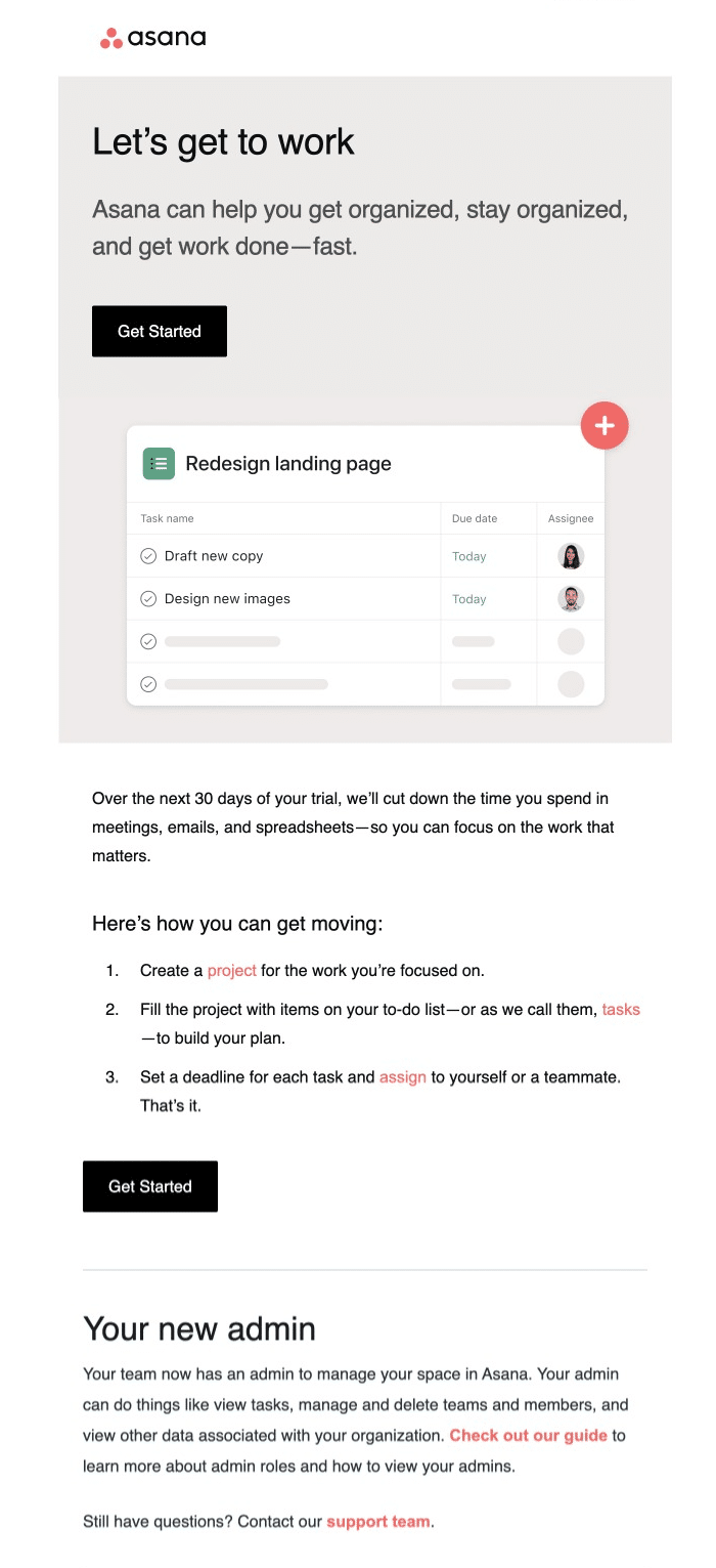
Why it works:
- Clear, action-oriented headline: “Let’s get to work”
- Concise value proposition: “Asana can help you get organized, stay organized, and get work done—fast.”
- Visual example of the product interface, showcasing a sample project
- Highlights the 30-day trial period and its benefits
- Provides a simple, three-step guide to getting started
Key takeaways:
- Clear value statement: Immediately communicate how your product benefits the user
- Show, don’t just tell: Include a visual representation of your product in action
- Provide a quick-start guide: Offer simple, actionable steps to get users engaged right away
- Highlight trial benefits: If offering a trial, clearly state its duration and advantages
- Introduce key features: Briefly explain important aspects of your product (like admin roles)
For businesses in the productivity and team collaboration space, this email demonstrates how to create a welcome that not only introduces your product but also gets users to take action immediately. It’s especially relevant for SaaS products that benefit from quick user adoption and engagement.
It’s Time to Create Your Own Welcome Emails
Now it’s your turn! Take these ideas and put your own spin on them to come up with a welcome email that will engage your customers and drive action.
You can use some of the best practices we’ve seen in these examples in mind when you’re crafting your emails.
Remember, the best welcome email for your business will depend on your specific audience and product. Use these examples as inspiration, but always test and iterate based on your unique needs and user feedback.
And don’t forget to follow up! A single welcome email is great, but consider a short welcome series to gradually introduce new users to your brand, products, or services.
That’s it! Now you‘ve seen some great examples of welcome emails.
Next, do you want to make sure your newly-crafted welcome email looks great on all devices? Check out our tutorial on designing emails for dark mode for more information.
